Pelikan Brilliant Red Ink Review

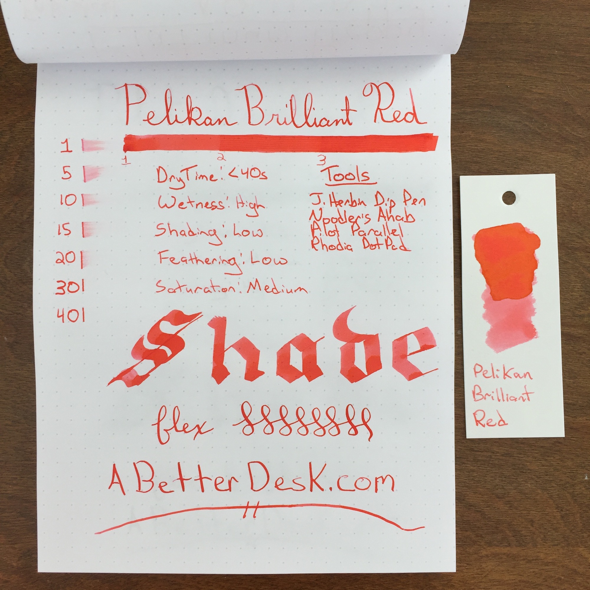
Pelikan Brilliant Red ink is aptly named. It doesn't compete with the deeper red inks, which I typically prefer; however, it is stunningly bright. The ink is complimented by the orange and yellow tones of sunset, which are subtle with regular usage, but obvious in the ink swatch.

Pelikan Brilliant Red does have subtle shading and saturation properties, but overall the ink's color was incredibly consistent, with all but my Pilot Parallel. I typically use a flex nib because I want to see color variation; however, I much prefer this ink with the thicker lines produced by the Noodler's Ahab flex nib, over a standard nib.

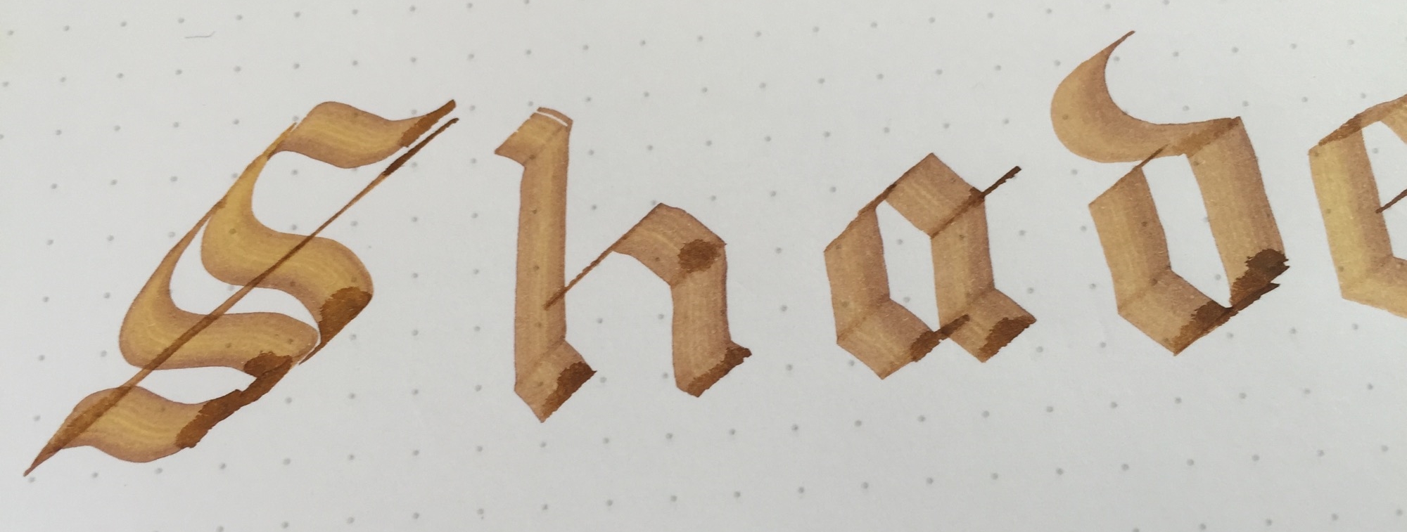
I noticed something peculiar when running Brilliant Red through my flex test. As the nib lay ink on the paper, the ink appear almost gel-like in consistency, as illustrated in the picture below. Perhaps this is responsible for the ink's consistent color and minimal shading properties, but I'm not sure.

Pelikan Brilliant Red ink is a solid performer for those looking for a consistent color and minimal shading. This ink is almost highlighter bright, and I think that it would work well for marking up/grading papers or calling out important bits of information. The dry time is pretty close to 30 seconds, which is on par with most inks. Although this ink isn't a personal favorite, I would happily recommend it to those who may prefer its lighter color. Personally, I'm going to stick with Red Dragon for now.
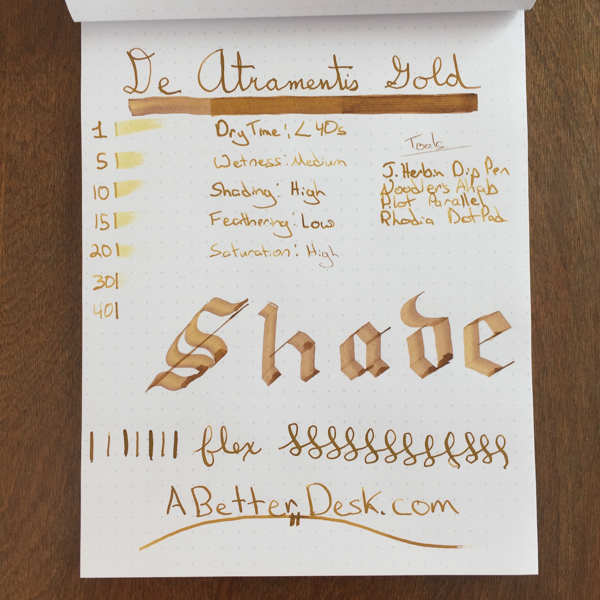
Stats

  • Dry Time: Less than 40s
  • Wetness: High
  • Shading: Low
  • Feathering: Low
  • Saturation: Medium

Tools


Like this post? Subscribe to our rss feed or follow us on Twitter and receive new post updates automatically.

Apica Notebook Review

Walk into any Japanese convenient store and you're likely to find a variety of pens and high-quality paper. Campus notebooks are one of the most common brands. These thin notebooks come in various sizes and are sturdy enough for the average Japanese student on-the-go. Between two to four dollars in Japan, these 68 page delights are accessible, even on the smallest of student budgets.

The Apica CD15 notebook is a 68-page B5-sized notebook with personality. Apica notebooks are a slightly upscale version of the Campus notebook, and the slogan on the notebook cover says it all, "Most advanced quality. Gives best writing features." Awkward translations are common in Japanese paper goods and add a sense of playfulness and whimsy. The notebook is thread-bound, with sturdy binding tape to protect the spine. The cover is made of heavy cover stock, with a rough-textured surface.

It's hard to imagine walking into a convenient store to pick up fountain pen friendly paper, but Apica's paper is thick and works very well with a range of fountain pens and inks. While there is no visible bleed through, thicker nibs and certain inks do cause a light to moderate amount of feathering, but I'm very pleased with the paper's performance.

I've tested multiple notebooks of various sizes and paper types, and I'm in love with the 68 page B5 format of this notebook. The paper size is large enough for substantial writing projects, but the small page count makes the notebook very portable and reduces my notebook completion anxiety. The Apica CD15 notebook is a fantastic find. I use the notebook to draft all of my blog posts and continue to do so for the foreseeable future.


Like this post? Subscribe to our rss feed or follow us on Twitter and receive new post updates automatically.

De Atramentis Gold Ink Review

Everybody needs ink with a little bling every now and then. Whether you're signing your Vegas marriage certificate or sketching the piles of money that you plan to make by selling the epic novel that sits unfinished on your desk, there's no better color than gold to emphasize extravagance and luxury. De Atramentis Gold may just be the color that's worthy of illustrating your imagined success.

De Atramentis Gold looks like liquid gold on the page and is somewhat thicker than typical fountain pen inks. This is hard to see with a finer nib, but it's obvious with my Pilot Parallel. While most inks fill in the channels left from the serrated edges of the Parallel's nib, De Atramentis Gold stays in place, leaving noticeable stripes on the page. The ink dries in less than 40 seconds with a fine nib, which is longer than a typical dry time of 20 to 30 seconds. This probably isn't going to be an everyday carry ink, so a longer dry time isn't a detriment.

I chose De Atramentis Gold to review this week since I've grown a bit bored with traditional colors. I can't say that I plan to use it daily, but I was pleasantly surprised by the ink's true golden color and solid performance. All kidding about extravagance and luxury aside, this ink is an excellent inexpensive choice if you're looking to give one of your prized pens the Midas touch.

Stats

  • Dry Time: Less than 40s
  • Wetness: Medium
  • Shading: High
  • Feathering: Low
  • Saturation: High

Tools


Like this post? Subscribe to our rss feed or follow us on Twitter and receive new post updates automatically.

Casual Sunday - March 6, 2016

It's Sunday, which means it's time to pour a cup of coffee, snuggle up next to the pooch, and catch up on current events.

Interesting Finds:

In Other News:

  • Thank you all for the kind feedback for last week’s six month post. I’ve been a little burned out this week, mostly due to major changes at work, so it’s hard to explain just how much your support means to me. I think that this lovely post From the Pen Cup sums this past week up nicely.

Thanks for checking out this week's issue of Casual Sunday. Check back in on Tuesday morning for a brand new blog post or follow A Better Desk on Twitter or via RSS feed so that you don't have to. Thanks for your support!


Like this post? Subscribe to our rss feed or follow us on Twitter and receive new post updates automatically.

Six Months of A Better Desk

Six months ago, I set out on a journey to find my voice. As my day job became more stressful, I began to long for an outlet and escape from the stresses and pressures of everyday life. My everyday life began and ended in the digital world, where I created bits and bytes that were often launched into the abyss and never seen again. Although writing has always been my outlet, the need to create something physical couldn't be appeased by clickety clacking on a keyboard. I discovered a solution to my dilemma in the pen and paper community.

Most of us live our lives in hopes of finding our passion and building meaningful connections to others, or maybe that's just me. I began my inky journey not knowing where it would lead. As I began to explore the world of pen and paper, my love not only grew for the medium but for the passionate and friendly community that welcomed me with open arms.

We may never have met, but your support and encouragement has gotten me here. I am truly grateful for this little community that's shown me that writing doesn't have to happen in front of a blue screen in a dark room and that the mistakes, scratches and scuffs are the most beautiful parts of the work that we do.

Thank you for letting me be a part of something awesome.


Like this post? Subscribe to our rss feed or follow us on Twitter and receive new post updates automatically.