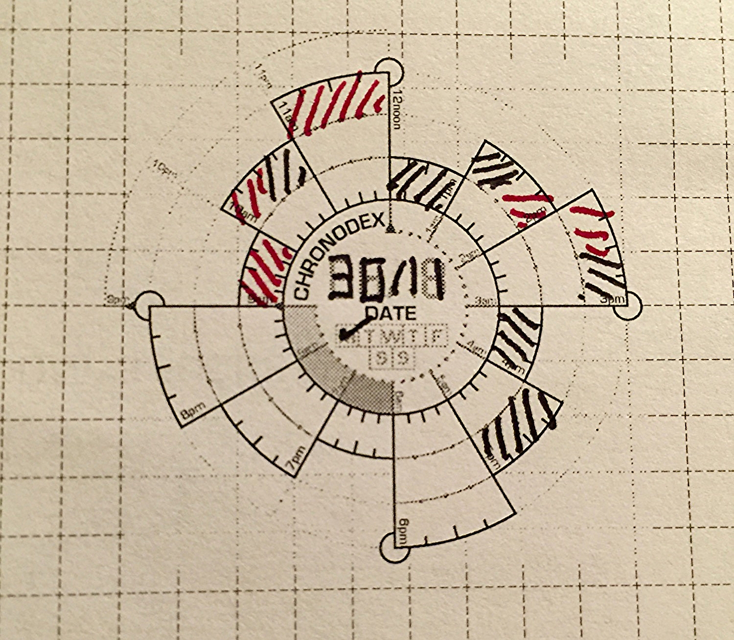
I stumbled upon Patrick Ng's Chronodex system while researching the Midori Traveler's Notebook. This little paper template has changed the way that I work. The system is simple, with 24 hours divided into a clock-like spiral. The layered spiral makes it possible to capture both AM and PM in a very compact space. An entire five day work week fits on two pages of a Midori notebook, which is the same length but skinnier than a standard A5 sheet. Each cell of the spiral represents an hour, and Patrick recommends shading the cells different colors based on daily calendar events. The common use is to copy an entire calendar day into a single Chronodex, with callout lines explaining each event. This method may work for some, but I struggle with the redundancy of having two version of the same calendar.
Diamine Onyx Black for the busy times and Diamine Red Dragon for the free times.
My digital calendar is just fine at what it does, and I don't need/want a paper replacement. My work requires that others have access to my calendar for scheduling student appointments and checking my availability, so a paper calendar is out of the question. While my calendar is good at telling me where I have to be, it's pretty crappy at helping me to see how much free time I have in a given day. It's even worse at helping me to decide which tasks should be tackled within that free time. This is where my adapted version of the Chronodex system comes in. Instead of copying my entire calendar, I look at my calendar every morning and shade all of the times that I'm busy as black. I shade all of my free time as a bright color, such as orange or red. In my brain black means busy, and color means freedom. Why is this useful? This gives me a very simple snapshot of how much time I really have available to work on my todo list. It helps me to set realistic expectations for what is possible and addresses my terrible tendency of overestimating how much I can do in any given day. Once I have free time mapped out, I move to my beloved Omnifocus to tell me what to do next.
Planning by the firelight.
Omnifocus is a powerful task management tool that allows me to easily track hundreds of tasks across multiple platforms, without letting important due dates slip through the cracks. The problem with Omnifocus is that I'm very easily distracted by all of the tasks that are waiting for me there, and it's easy to go down the rabbit hole of fiddling with and organizing my todo list. To be clear, Omnifocus does a great job of showing me what I need to see, but I find that I'm more productive if I keep it closed for most of the work day.
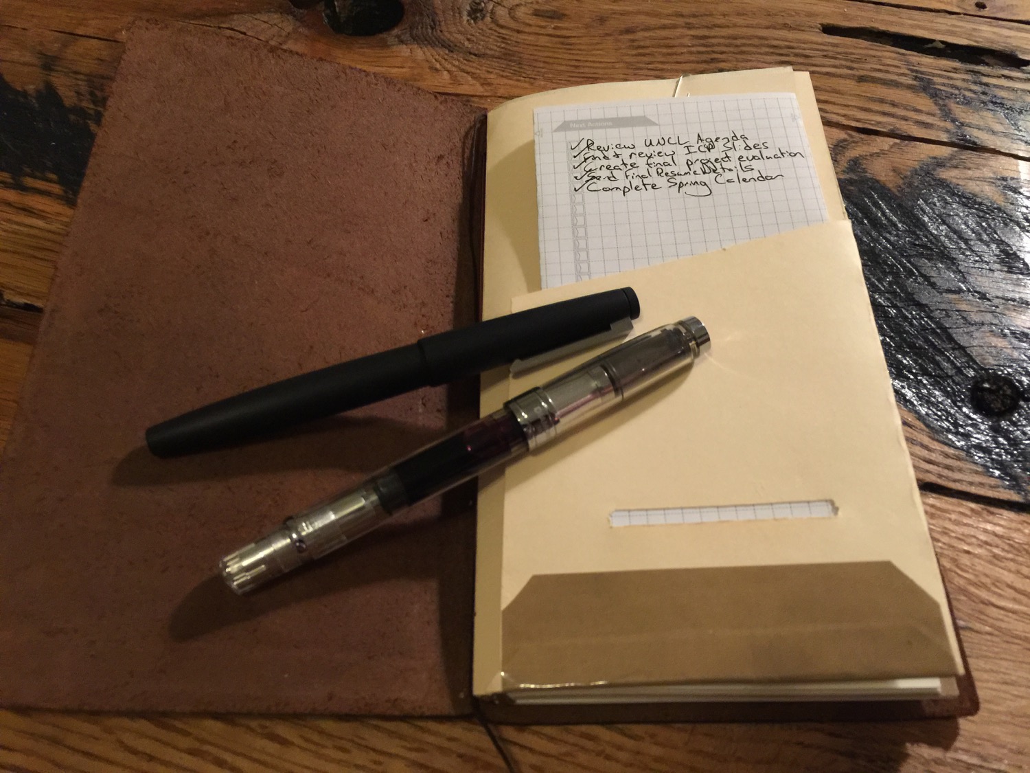
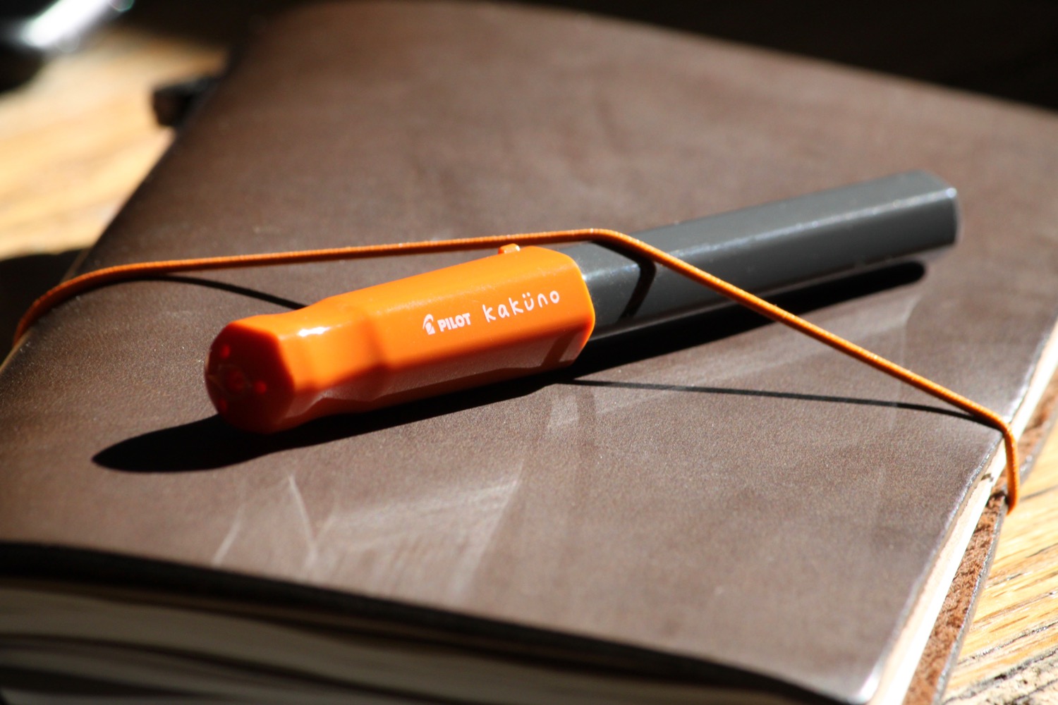
My daily Chronodex page lives in a homemade folder in my Midori, which travels with me everywhere.
I take the most important tasks from Omnifocus and copy them into the Next Actions section of my Chronodex sheet. I only copy as many tasks as I think that I can realistically accomplish in the given free time that I have for the day. If I only have an hour of free time in an eight hour day, which happens quite often, I'm not going to worry about that big report that's due next month. Instead, I'm going to tackle those one or two items that absolutely have to be done by tomorrow morning. Some days I have one or two actions, and others I have five-ten.
Once my next actions are copied onto my Chronodex page, I shut my task manager down for the day and focus only on those tasks that are written down. It's a much better feeling check off all of these tasks by the end of the day, compared to that of constantly facing all of the tasks waiting for me in my task management software. I tried the Chronodex on a whim and found it confusing and hard to read at first. I wondered if a paper planning workflow could ever be anything but redundant. I'm glad that I stuck with it. After a few weeks, I can easily glance at my Chronodex and tell how much free time I have. I'm getting better at being realistic about what I can accomplish in a given day, making me more productive and less guilt-ridden about the tasks that remain.
The template that I use has a day for each side of the paper. I'm investigating more paper-efficient options.
Patrick Ng's Chronodex system is a paper tool that adds sanity to my highly-digital life. As a pen geek, I realize that sometimes I use pens and paper in ways that are less productive than using computers. This isn't one of those times. Patrick's tool has changed the way that I work and reduced the noise caused by a constant digital buzz. I'm just getting started with the Chronodex, but I plan to cover it more in the future, as my digital/analog workflow matures.
Have you ever tried to use the Chronodex or other analog system. What works for you?
Thanks for checking out this week's issue of Casual Sunday. Check back in on Tuesday morning for a brand new blog post or follow A Better Desk on Twitter or via RSS feed so that you don't have to. Thanks for your support!
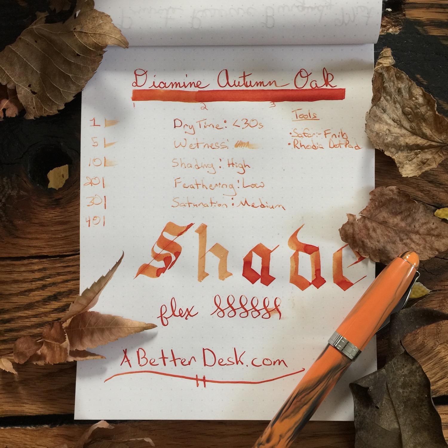
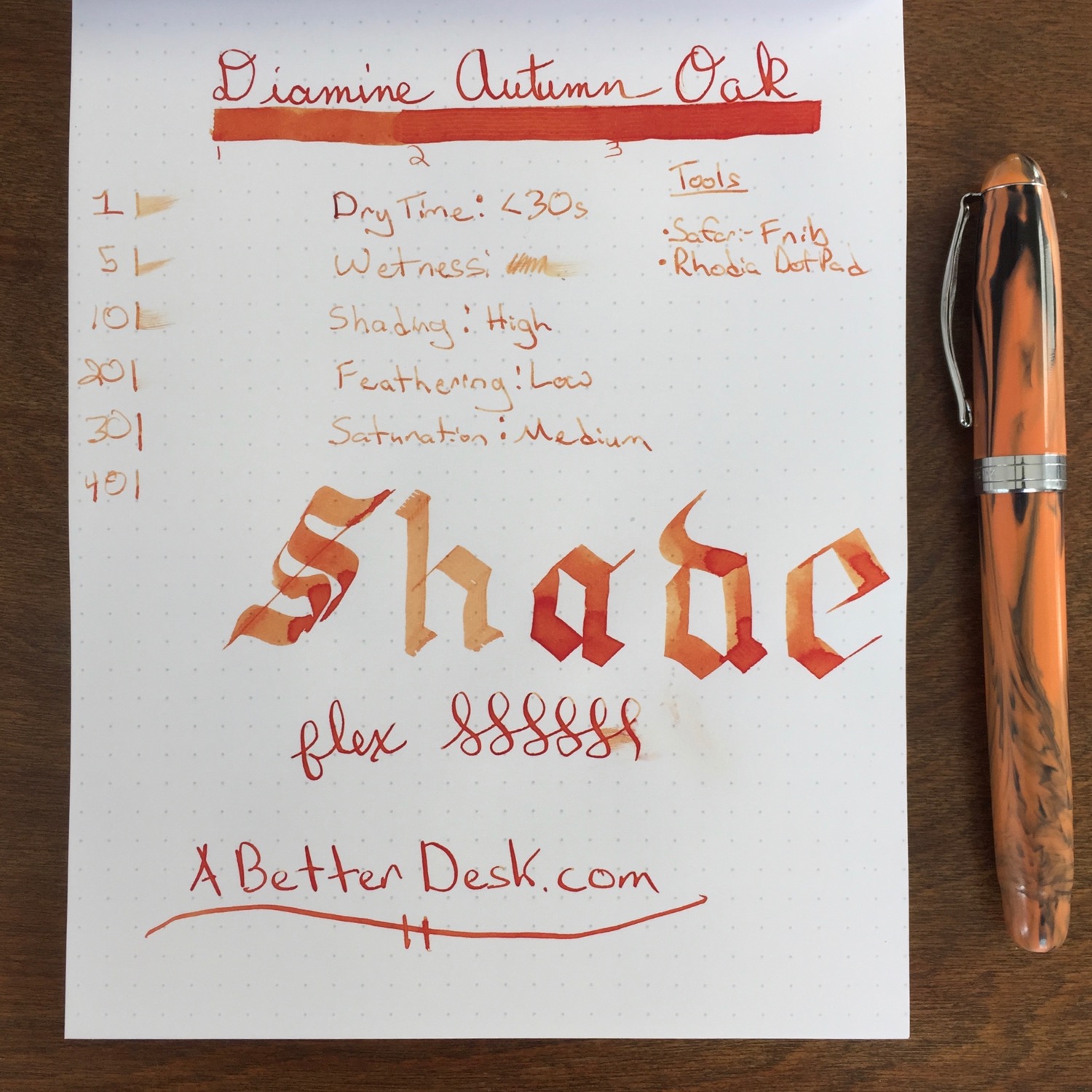
The leaves are falling from the trees and cold weather is moving in. Thanksgiving is all that remains between fall and the blustery winds of winter. Before we bid fall adieu, let's celebrate its fading glory with one final fall ink review. Diamine Autumn Oak is a mellow orange ink with excellent shading properties. The color resembles that of an autumn leaf, with shades of orange and brown.
Autumn Oak is relatively dry and has a moderate dry time of slightly more than 20 seconds. The ink is all about shade, and Autumn Oak has the best shading properties of any ink that I've tried so far. It works best with wider nibs or flex nibs which show off the ink's shading properties. Autumn Oak can be used in finer nibs, but it's a bit too light to use as a daily workhorse ink, unless the nib is really juicy. Autumn Oak has medium saturation, with little distinction between the second and third bar in the ink test.
Diamine Pumpkin is my favorite orange to date, and its low shading and vivid color make it worthy of always being inked up. Compared to Pumpkin, Diamine Autumn Oak is much lighter on the page and leans closer towards brown. Pumpkin resembles the bright leaves at the beginning of fall, while Autumn Oak shows off the orangy browns of leaves that have fallen from the trees.
Diamine Autumn Oak isn't something that I would keep inked up all the time, but the ink's phenomenal shading properties and color make it a worthy addition to any ink collection.
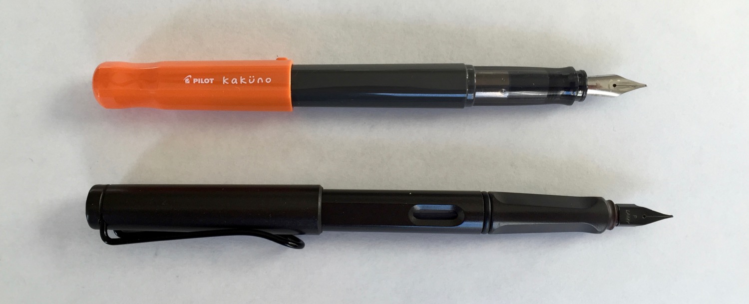
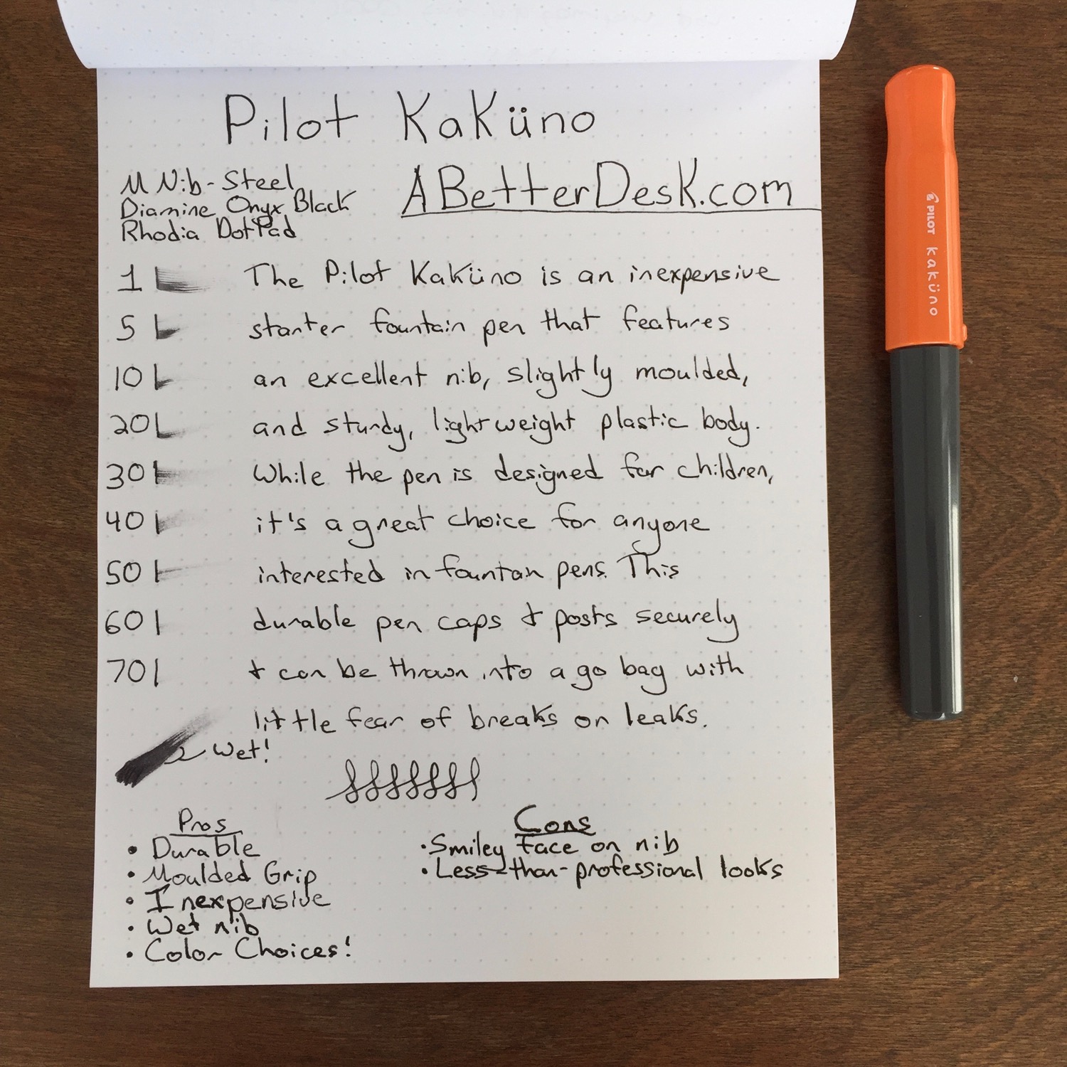
The Pilot Kakuno isn't the pen that you're going to pull from a suit pocket to sign an important document at a stuffy business meeting. In fact, this pen is very easy to dismiss at first glance. It's not sleek and sexy, and it isn't going to wow your friends. Despite first appearances, the Kakuno is a very good pen. It's certainly marketed towards children but, cute packaging and smiley nib aside, it's a great option for anyone from the first-time pen buyer to a pen fanatic who's looking for a solid performer to test inks.
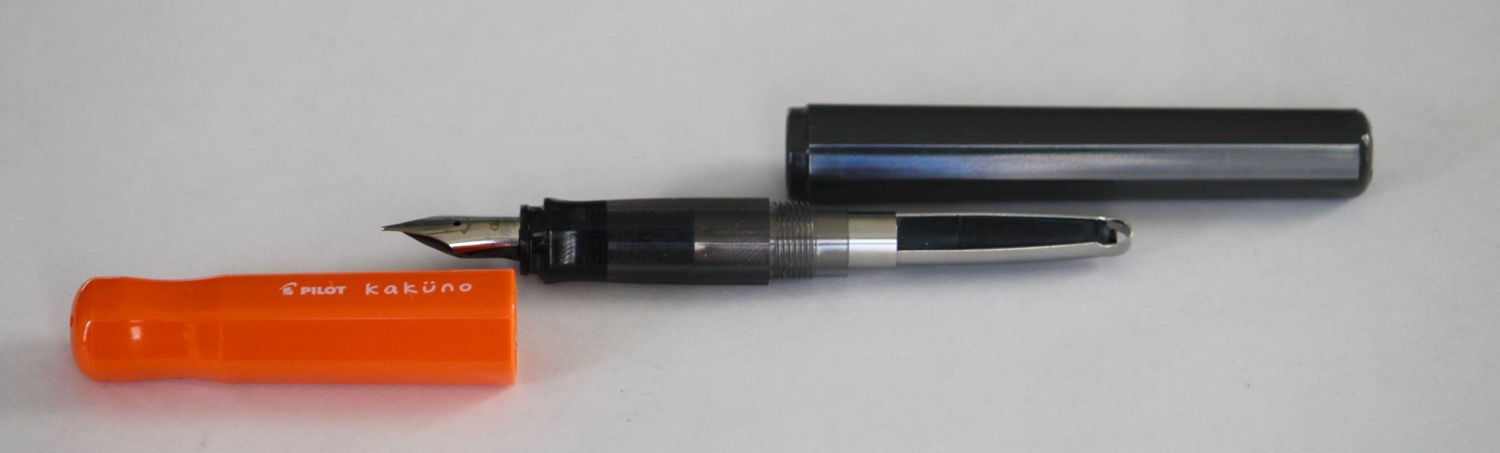
The Pilot Kakuno's body is made from a lightweight plastic that comes in several color combinations. I chose the Kakuno with a solid gray barrel and orange cap. The pen's grip is translucent and slightly moulded, much less so than the grip of the Lamy Safari. The translucent grip shows the inner workings of the feed mechanism, which is a plus for those who are learning about pens and want to know what's going on under the hood. The Pilot Kakuno is very light, but the grip and thicker barrel create an extremely comfortable writing experience.
The Pilot Kakuno's cap uses a snap fit mechanism and caps securely with a satisfying click. Although there's a small plastic nub to assist with uncapping (I assume), this pen is almost impossible to uncap with one hand. This comes from someone with gorilla hands, so avoid the pen if uncapping with one hand is important. The secure cap does protect from accidental uncappings and leaks. The pen fits comfortably in hand both posted and unposted, and the cap posts very securely on the pen's barrel. The cap has flat sides that prevent the pen from rolling.
A Pilot standard ink cartridge accompanies the Pilot Kakuno's cutesy packaging, but the Pilot converters fit as well. I popped the squeeze converter out of my Metropolitan and snapped it snuggly into place in the Kakuno with zero issues, aside from the crappiness of the squeeze converter.
The Pilot Kakuno's nib is on par with the nib on the Pilot Metropolitan, aside from the addition of a subtle smiley face engraved on the nib. It's a stellar nib for the price. I chose a Kakuno with a medium nib, since Japanese nibs run very fine. The fine nib on my Metropolitan is much too narrow for my liking, but the medium nib on the Kakuno is perfect. The Kakuno's medium nib is comparable to a European fine nib, like the one on the Lamy Safari. The nib lays down a juicy line and glides across the paper with ease.
At less than $15, the Pilot Kakuno is an excellent starting point for those diving into fountain pens. How does it hold up to the Pilot Metropolitan? It really depends on what the user is looking for. The Metropolitan is a classy-looking pen with a nice weight, but the Kakuno provides a superior writing experience, thanks to its secure posting and slightly moulded grip. Both have nearly-identical nibs, but the Kakuno's creative design gives it an edge over its older sibling.
Forgive the inconsistencies in the writing in the last part of the review. I ran out of ink mid review.
The North Wind Ink Drop - Goulet Pens offers an ink sampler subscription that ships 5 ink samples to your door each month for $10. It’s a great way to try tons of different inks without selling a kidney. This is my first month, and I can’t wait to give these inks a try.
Lamy 2000 - I finally pulled the trigger, and it’s so so good. Rambly review to come.
Thanks for checking out this week's issue of Casual Sunday. Check back in on Tuesday morning for a brand new blog post or follow A Better Desk on Twitter or via RSS feed so that you don't have to. Thanks for your support!