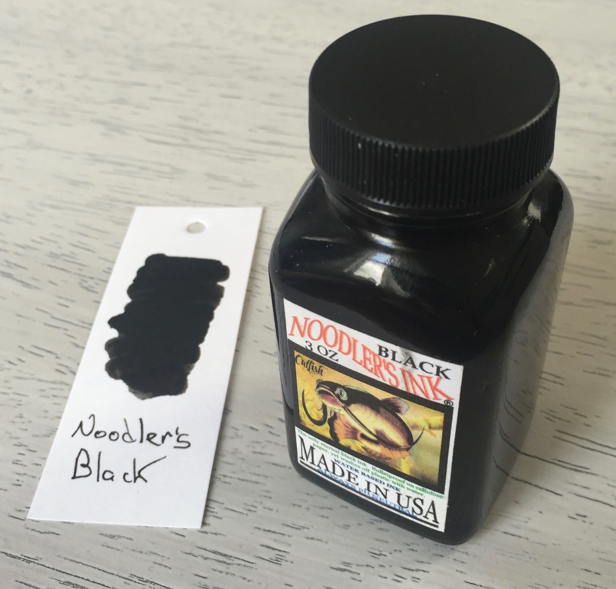
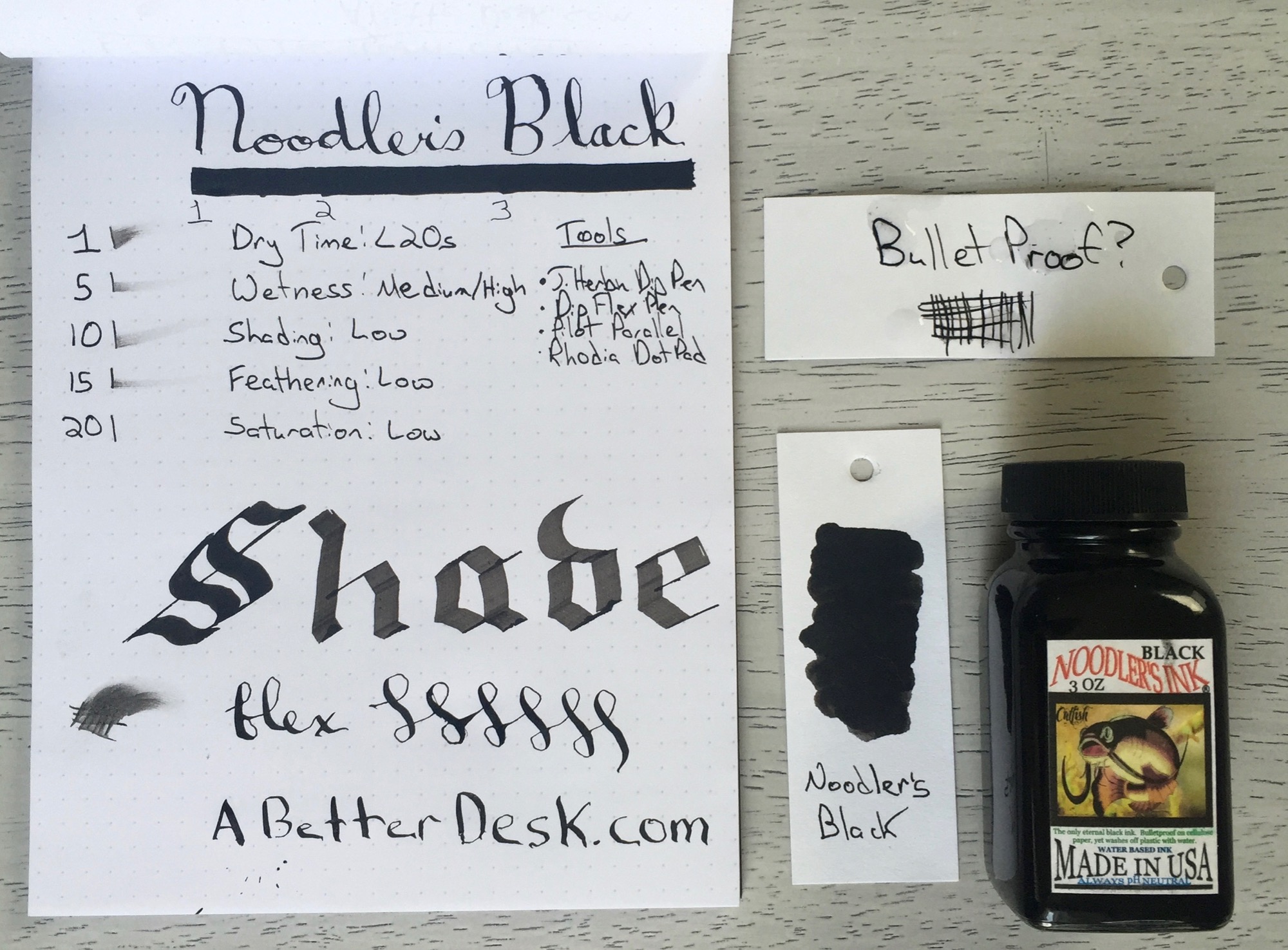
There's a special place in my heart for Noodler's inks. These inks come in a wide variety of colors and are very affordable. Noodler's Black fountain pen ink was the first bottled ink that I've ever purchased. I Googled "best fountain pen ink for beginners" and landed on a Fountain Pen Network post that mentioned Noodler's, specifically the bulletproof black ink. I was drawn to Noodler's quirky branding, high ratings, and affordable price, and bulletproof black has long served as a staple in my daily fountain pen rotation.
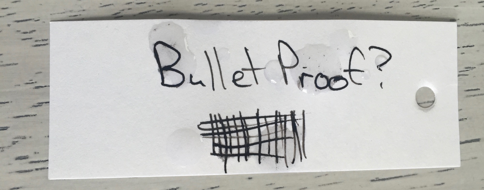
Noodler's Black ink is considered to be bulletproof, which means that it's water resistant and archival. This is the kind of ink that you'd want to use for love letters, messages in bottle, or labeling precious photographs. I typically don't water test inks, but it's important for an ink that claims to be water resistant to hold up well against a drip test. I dripped water on the word card below immediately after writing on the card, and the results were phenomenal. There were zero smears or bleeding, meaning that Noodler's Black passed the waterproof test with flying colors.
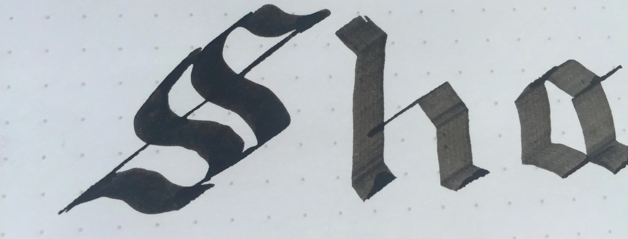
Although the archival quality of Noodler's Black is a big plus, the ink does tend to cling to everything it touches, including nib surfaces, converter walls, pen grips, and especially fingers. I'm wary of leaving any ink in my pens for long periods of time, but I'm especially careful with this ink. I should note that I've experienced zero permanent staining with Noodler's Black, but it does take extra effort to clean, and I'd rather be safe than sorry. Unfortunately, this problem is made worse by the ink's tendency to creep. I commonly find ink pooled around my fountain pen grips, around the air hole in nibs, and inside of nib caps. This is certainly better with some pens than others, but it is an annoyance nonetheless.
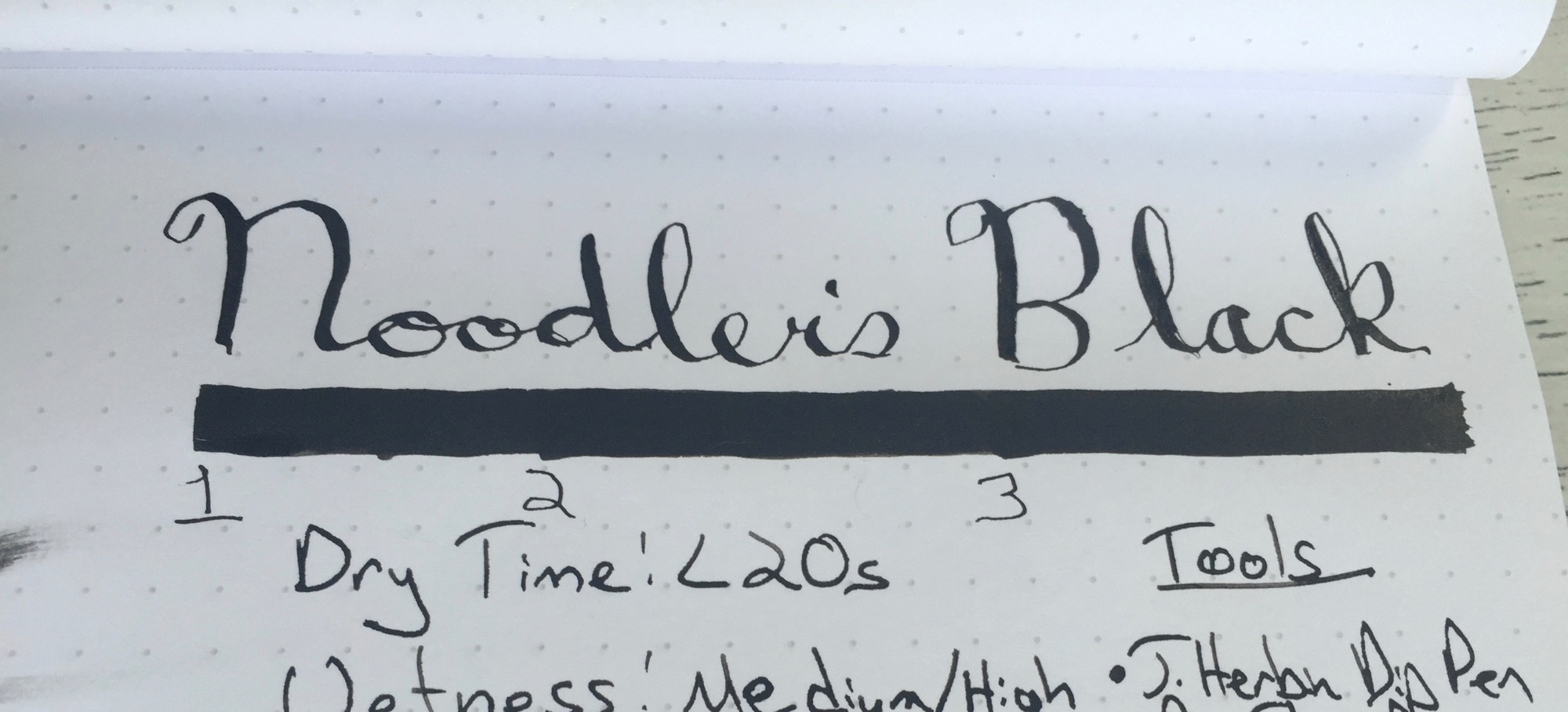
Noodler's Black fountain pen ink is a great choice for first time bottled ink buyers who are looking for a solid performing black ink with archival and waterproof qualities, but there are better alternatives for those who don't need these bulletproof qualities. Noodler's Black certainly has its quirks, but it counters these with an extremely affordable price, unique branding, and great color intensity on the page.
Stats
- Dry Time: Less than 20 seconds
- Wetness: Medium/High
- Shading: Low
- Feathering: Low
Tools
Like this post?
Subscribe to our rss feed or
follow us on Twitter and receive new post updates automatically.
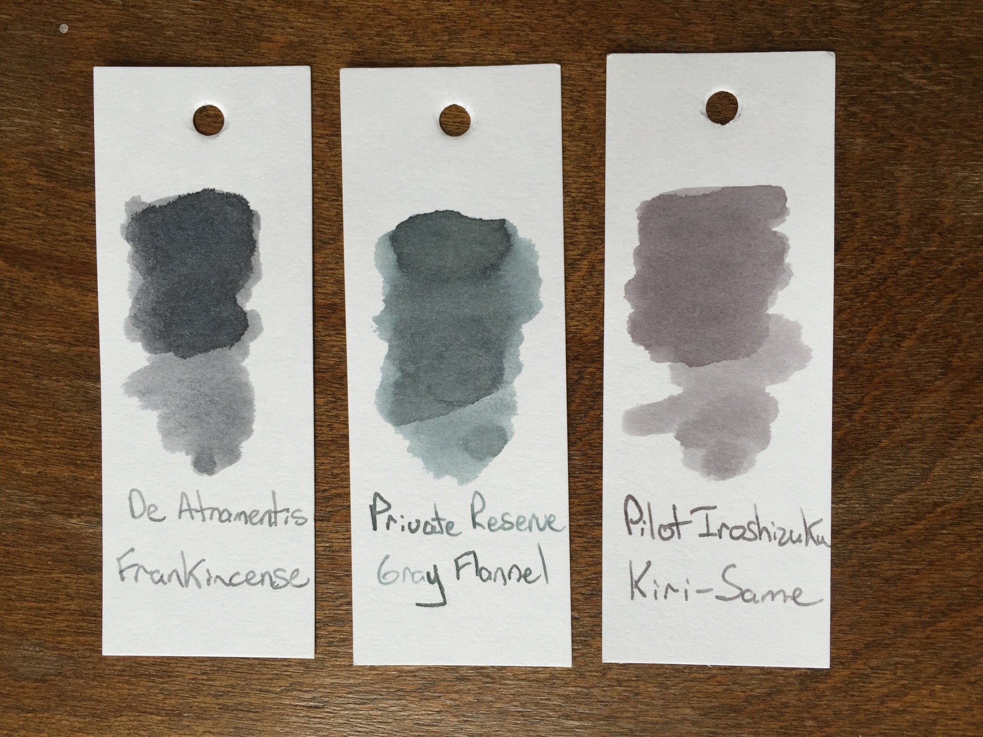
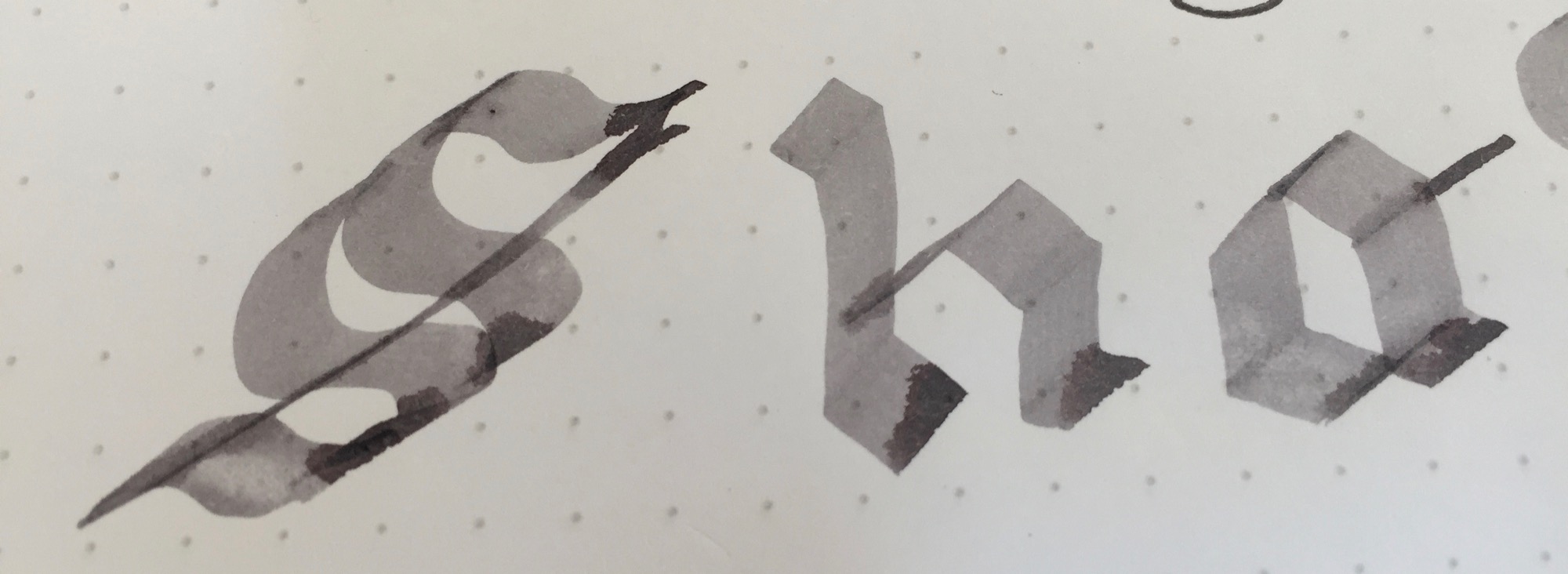
Although the winter weather has moved on, the skies are grey in the midwest this week. Grey skies always bring me back to blue and grey inks. Grey inks are my favorite shading inks, although I rarely have an opportunity to use them, and they're such an uncommon ink that they beg for a double-take when seen out in public. Although most grey inks shine in flex nibs, some of the darker inks can even be used in everyday writers, ensuring that their user has the coolest signature in the office. This week, I'm taking a look at Pilot Iroshizuku Kiri-Same ink, an ink that captures all of the best parts of grey skies and misty days.
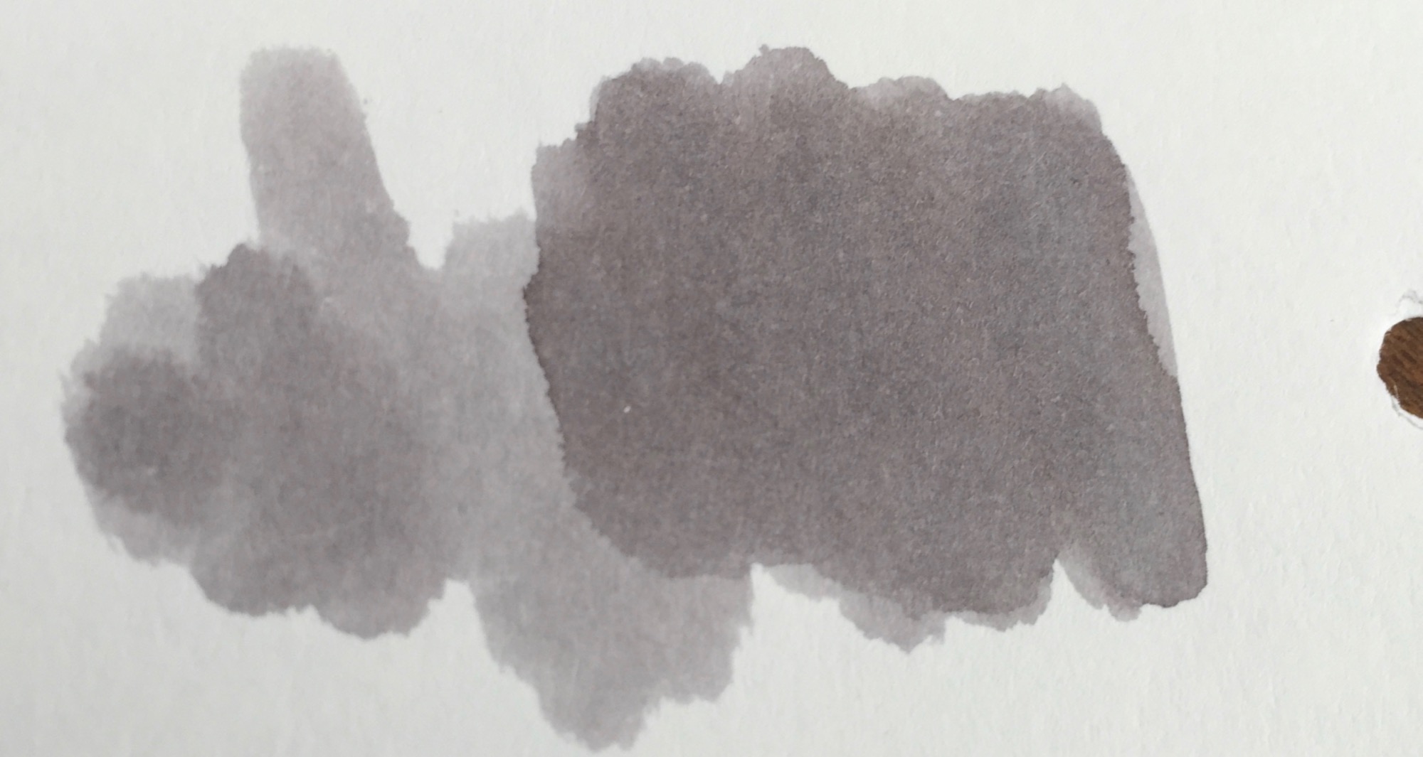
Pilot Iroshizuku Kiri-Same is on the lighter side of the grey spectrum. Just like its namesake, Kiri-Same resembles the clouds that come along with a misty rain. The ink swatch itself resembles a cloud, lighter grey around the edges with deepening shades of grey towards the center.
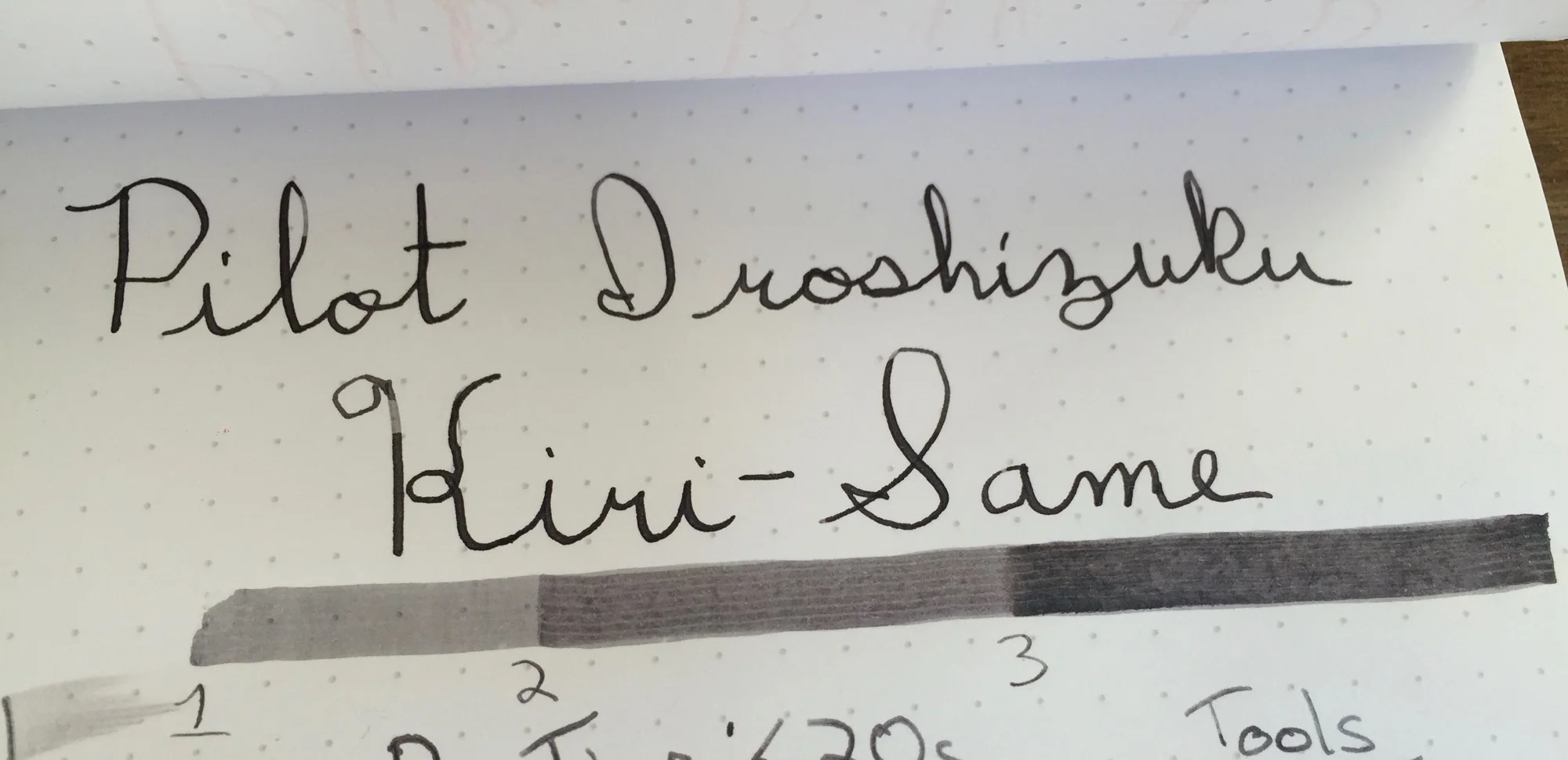
Kiri-Same is dark enough to load into your favorite fine-nibbed pen, as long as the nib tends to leave a lot of ink on the page. Since the ink's shading properties are so high, dryer nibs leave a much lighter line than their juicier counterparts. Flex or calligraphy nibs are where this ink ink belongs, and it performs splendidly in either, leaving lines which show significant color variation.
Pilot Iroshizuku Kiri-Same may come at a price premium, but its performance is well worth the price hike. Kiri-Same has a relatively fast dry time, and its shading properties make for a great sketching or calligraphy ink. With Kiri-Same, grey skies and rainy days come alive on the page.
Stats
- Dry Time: Less than 20s
- Wetness: Medium
- Shading: High
- Feathering: Low
- Saturation: High
Tools
Like this post?
Subscribe to our rss feed or
follow us on Twitter and receive new post updates automatically.
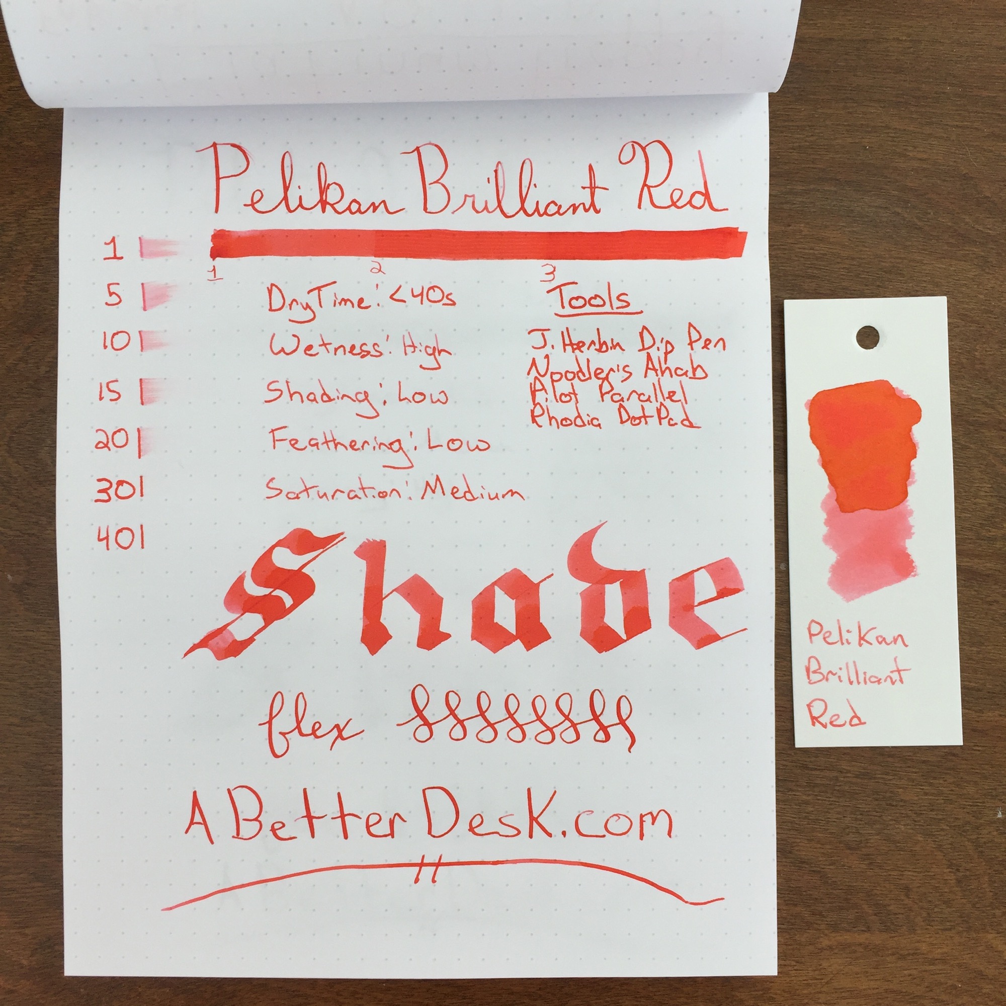
Pelikan Brilliant Red ink is aptly named. It doesn't compete with the deeper red inks, which I typically prefer; however, it is stunningly bright. The ink is complimented by the orange and yellow tones of sunset, which are subtle with regular usage, but obvious in the ink swatch.
Pelikan Brilliant Red does have subtle shading and saturation properties, but overall the ink's color was incredibly consistent, with all but my Pilot Parallel. I typically use a flex nib because I want to see color variation; however, I much prefer this ink with the thicker lines produced by the Noodler's Ahab flex nib, over a standard nib.
I noticed something peculiar when running Brilliant Red through my flex test. As the nib lay ink on the paper, the ink appear almost gel-like in consistency, as illustrated in the picture below. Perhaps this is responsible for the ink's consistent color and minimal shading properties, but I'm not sure.
Pelikan Brilliant Red ink is a solid performer for those looking for a consistent color and minimal shading. This ink is almost highlighter bright, and I think that it would work well for marking up/grading papers or calling out important bits of information. The dry time is pretty close to 30 seconds, which is on par with most inks. Although this ink isn't a personal favorite, I would happily recommend it to those who may prefer its lighter color. Personally, I'm going to stick with Red Dragon for now.
Stats
- Dry Time: Less than 40s
- Wetness: High
- Shading: Low
- Feathering: Low
- Saturation: Medium
Tools
Like this post?
Subscribe to our rss feed or
follow us on Twitter and receive new post updates automatically.
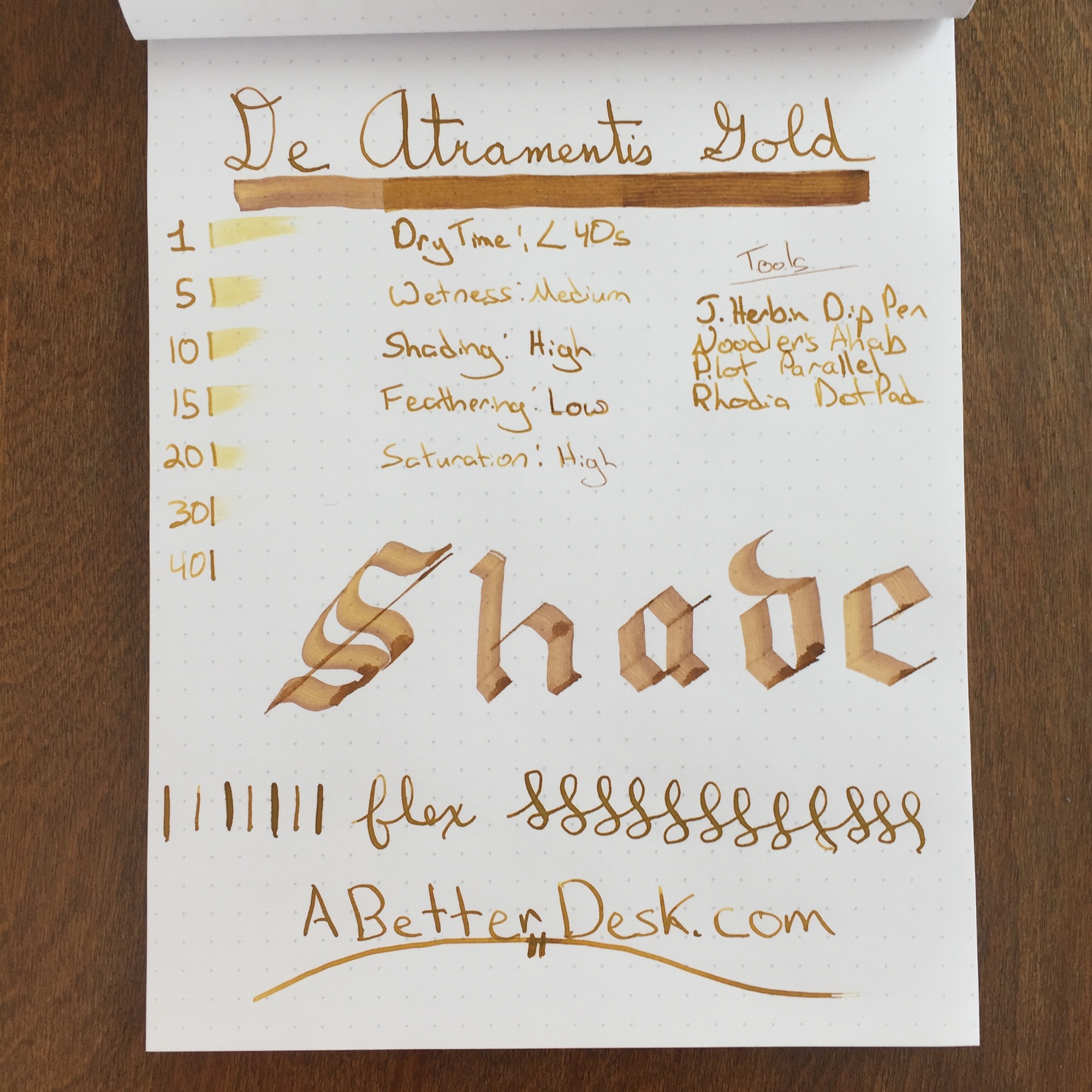
Everybody needs ink with a little bling every now and then. Whether you're signing your Vegas marriage certificate or sketching the piles of money that you plan to make by selling the epic novel that sits unfinished on your desk, there's no better color than gold to emphasize extravagance and luxury. De Atramentis Gold may just be the color that's worthy of illustrating your imagined success.
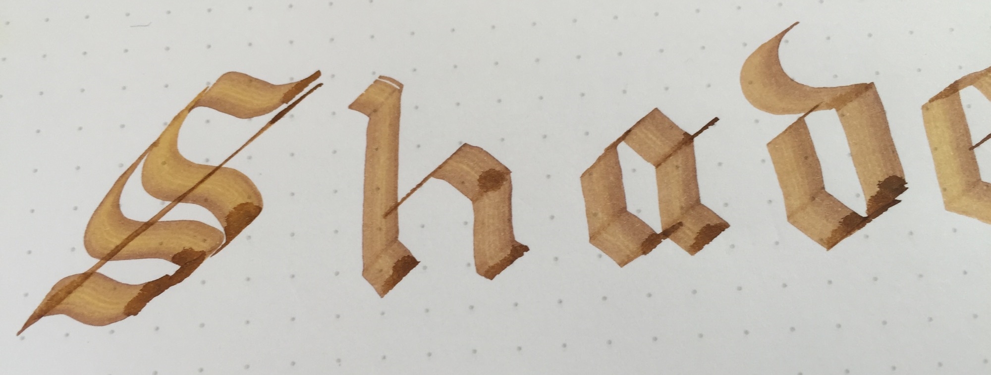
De Atramentis Gold looks like liquid gold on the page and is somewhat thicker than typical fountain pen inks. This is hard to see with a finer nib, but it's obvious with my Pilot Parallel. While most inks fill in the channels left from the serrated edges of the Parallel's nib, De Atramentis Gold stays in place, leaving noticeable stripes on the page. The ink dries in less than 40 seconds with a fine nib, which is longer than a typical dry time of 20 to 30 seconds. This probably isn't going to be an everyday carry ink, so a longer dry time isn't a detriment.
I chose De Atramentis Gold to review this week since I've grown a bit bored with traditional colors. I can't say that I plan to use it daily, but I was pleasantly surprised by the ink's true golden color and solid performance. All kidding about extravagance and luxury aside, this ink is an excellent inexpensive choice if you're looking to give one of your prized pens the Midas touch.
Stats
- Dry Time: Less than 40s
- Wetness: Medium
- Shading: High
- Feathering: Low
- Saturation: High
Tools
Like this post?
Subscribe to our rss feed or
follow us on Twitter and receive new post updates automatically.
Most of us lead our daily inky lives in black or blue. These colors are the safe choices for everyday use, but I find them less and less appealing as my pen and ink collection grows. A week with Iroshizuku Tsukushi in my Lamy 2000 has opened my eyes to the world of non-traditional ink colors. Why use blue or black when you can use a lovely shade of brown or green? The trick to using these colors in everyday writers is to find inks that are dark enough to read easily but have just enough shading ability to make things interesting. While Tsukushi lives on as my daily ink for now, there's room for more than one in my growing Penventory. This week, I'm taking a look at another vivid beauty, Caran d'Ache Vibrant Green.
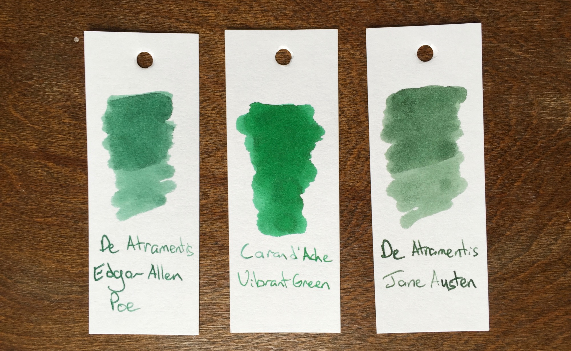
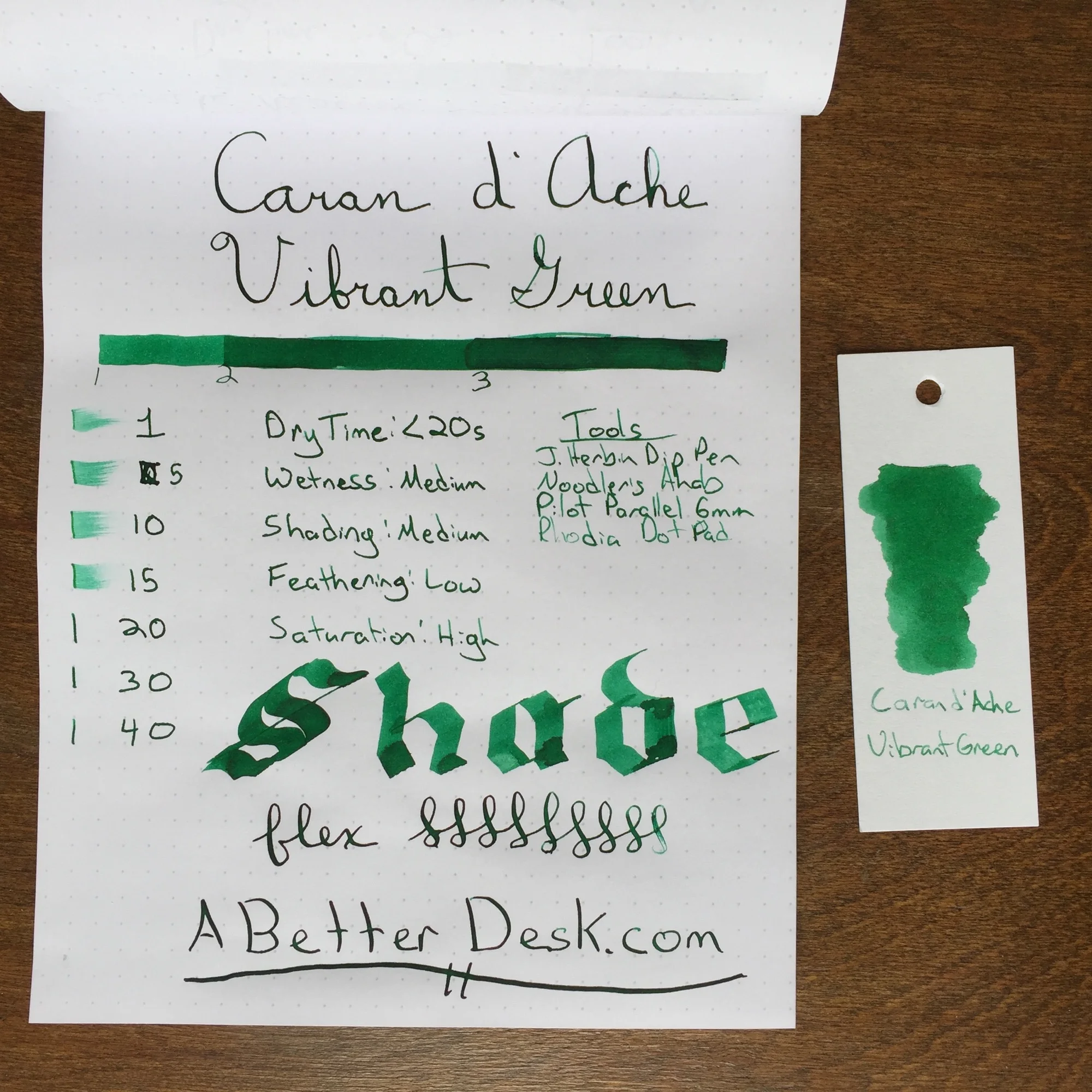
Vibrant Green is the most vivid of the green inks that I own. The color varies greatly, depending on the amount of ink that the nib lays on the paper. My J. Herbin Glass Dip Pen lays a deep forest green line on the page after a fresh dip, but the color lightens dramatically as the nib's ink channels empty of ink. The ink dries very quickly, which makes it a viable everyday ink.
Caran d' Ache Vibrant Green offers a significant amount of shade variation for such a dark ink. Shading is subtle in fine-nib pens, but the ink really shines in my Pilot Parallel Calligraphy Pen. The ink's fast dry time, vivid color, and significant shading ability make it an easy recommendation.
Stats
- Dry Time: Less than 20 seconds
- Wetness: Medium
- Shading: Medium
- Feathering: Low
- Saturation: High
Tools
Like this post?
Subscribe to our rss feed or
follow us on Twitter and receive new post updates automatically.

