It's hard to believe that it's been more than two years since I published my original review of the Pilot Metropolitan. The pen regularly makes the short list of recommended starter pens and is one of the few fountain pens that you'll find in non-specialty stores. I thought that it would be fun to revisit the Metropolitan, and what better way to do it than with the Animal Print edition?
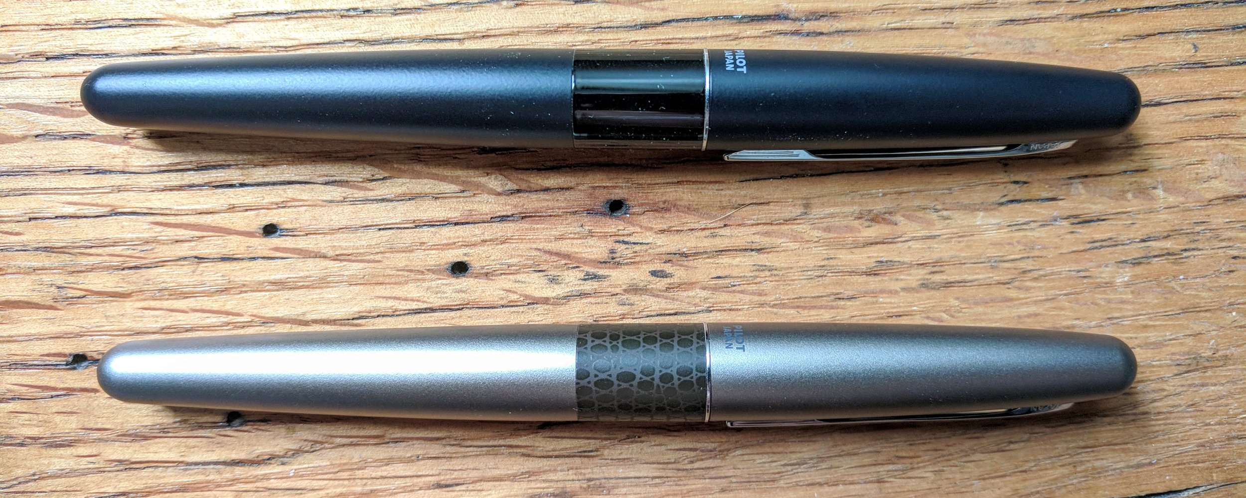
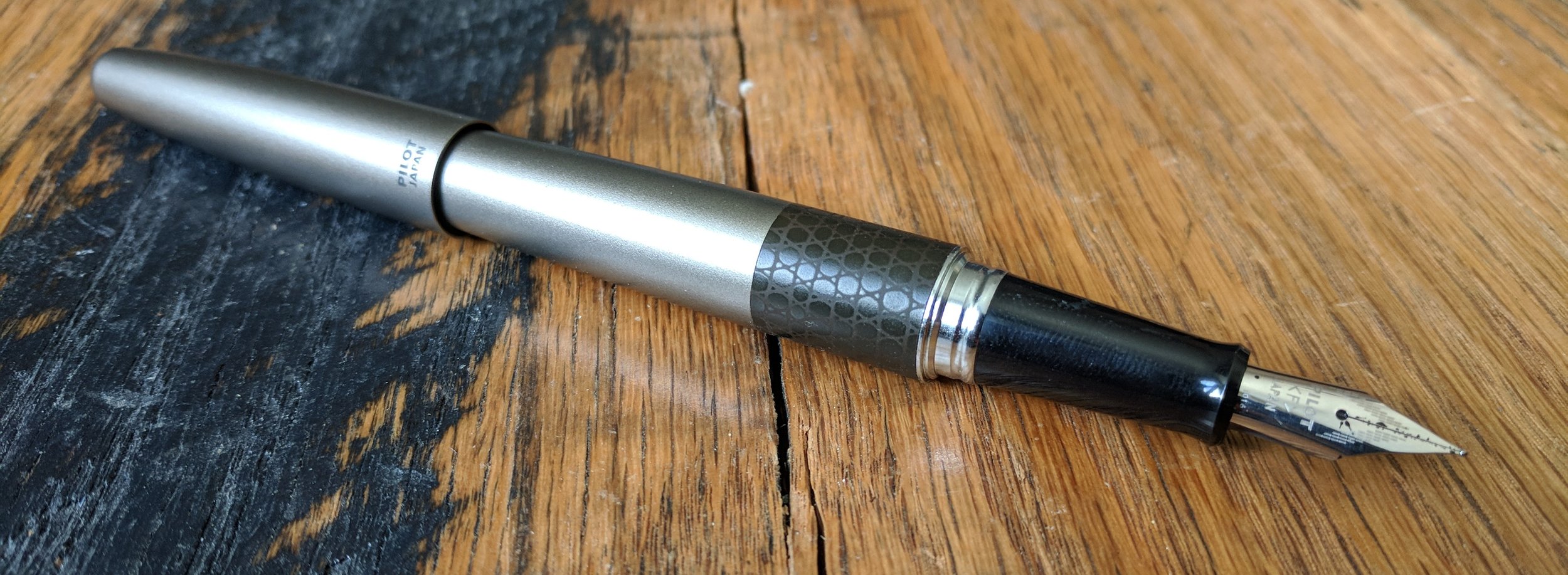
The Metropolitan doesn't feel like an inexpensive pen. Its metal body provides a nice heft, and the cigar-shaped sleek design really is stunning to look at. The clip has some give but still grips material firmly, so you won't have to worry about the pen sliding around or coming loose in a bag or pocket.
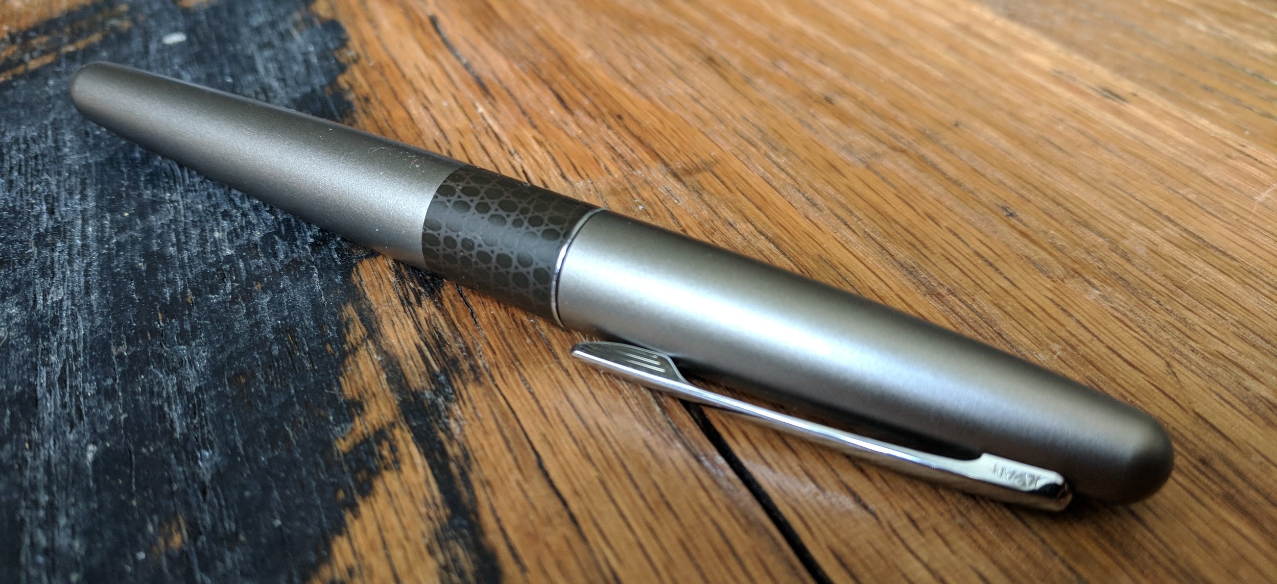
Compared to pens like the Lamy Safari or Pilot Kakuno, the Metropolitan has an understated design that will fit right into an office environment. In my original review, I mentioned that the pen was a bit boring on the surface, and the Animal Print edition, although a step up in flare, still holds true to this. Compared to my black Metropolitan though, the Gold Lizard is a nice change of pace. I actually didn't realize that the pen was gold until looking at the product details. It seems to be a gold/silver blend, of which I'm a huge fan. If you're looking for a more colorful version of the Metropolitan, there's also the Retro Pop edition.
Nope, the pens aren't different sizes. It's just the photo perspective.
The Metropolitan has my favorite clip cap of all the entry level pens that I've encountered. The cap seems almost magnetic when it clicks into place, and I would feel comfortable carrying the pen loose in my pocket, with no fear of leaks. It also posts nicely, with just a little bit of friction to lock the cap into place.
The Pilot Metropolitan's grip is made of smooth plastic and tapers towards the nib of the pen. Personally, I prefer the shaped grip of the Lamy Safari, or Lamy Vista, which reduces my hand fatigue during longer writing sessions, but the Metropolitan's thin grip still works nicely.
The nib is one of the Pilot Metropolitan's best features. Sometimes inexpensive fountain pen nibs can be scratchy or suffer from skips or hard starts, but this isn't the case with the Metropolitan. The ink flows steadily for long periods of time, and the nib is very smooth for its price point.
For $15 or so, the Pilot Metropolitan offers a fantastic experience for those looking for a starter fountain pen, and the Animal Print edition adds a creative touch to the pen's classic design. It comes with everything you need to get started, including both an ink cartridge and a converter for bottled inks. The squeeze converter is less efficient than twist converters that come with pens like the Lamy Safari, but it still gets the job done.
Will the Animal Print edition change your mind about the Pilot Metropolitan? Probably not, but it's still a damn fine pen for the price.
This pen was provided at no cost by For My Desk, for the purposes of this review. If you're interest in the Pilot Metropolitan Animal Print Fountain Pen, check it out on their site!
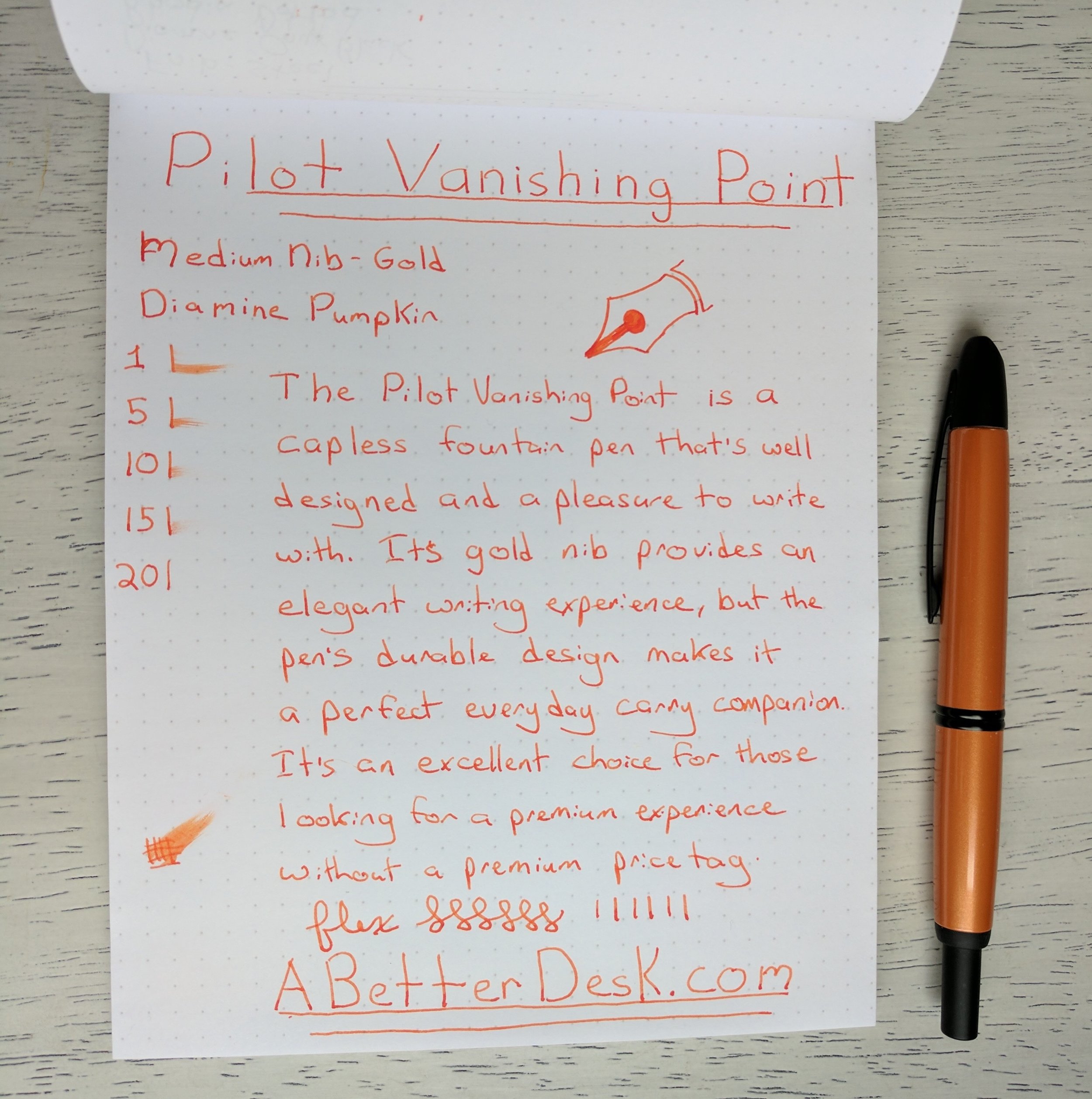
When I think of U.S. campus bookstores, I imagine overly-priced flimsy spiral notebooks, cheaply made coffee mugs, and sports apparel. This isn't a place to go to find the best writing instruments or paper. Japanese campus stores are vastly different. I visited Kyoto Sangyo University, for a conference in 2015, and was amazed by the campus store. There were rows upon rows of notebooks, as well as a wide range of pens and pen cases. While this was drool-worthy in itself, it was the pen at the bottom of a glass display case that caught my attention. I had never seen a Pilot Vanishing Point in person before, but there it sat, shining in the florescent store lights. $200 seemed like an outrageous price at the time, but the experience cemented the Vanishing Point in the back of my mind.
Fast forward a year and my pen hobby has teetered towards obsession. I worked my way up to the Vanishing Point over time and finally decided to pick up a Desert Orange Vanishing Point from Amazon. It's difficult to gage the orange color from pictures, but it's a subtle orange with shades of brown. Since this color is a part of the Metallic series, it has small flecks in the pen body which shimmer in the light. Overall, I wish that the orange was more vibrant, but it's still my favorite color out of the bunch.
The Pilot Vanishing Point's metal body gives it a nice heft. Although the smooth lacquered body would be slippery to grip on its own, the matte black tip provides a subtly-textured surface that grips well. The Vanishing Point is capless and uses a nock mechanism (the clicky thing) to reveal the tip, similar to a standard capless ballpoint. The pen clip is attached to the pen body at the grip area and has two small finger indentations, which allow for fingers to slide into place and grip the pen comfortably. The clip was my biggest concern, but I've been pleasantly surprised by how comfortable the pen is to hold. I am right-handed, so lefties should definitely try the pen themselves or refer to a lefty review before purchasing.
There are only a few capless fountain pens in the wild for a reason; they're hard to design. Pens like the early versions of the Lamy Dialog have received negative reviews, due to dried out nibs, but the Vanishing Point seems to have gotten this right. Depressing the nock pushes the nib through a small metal door, which moves out of the way and exposes the nib. Clicking the nock again recesses the nib and closes the metal door, keeping air out of the pen chamber. Side note, the nock's click is extremely satisfying.
The nib for the Desert Orange Vanishing Point is a sleek black color, but the nib color varies by body color style. Although the pen comes with a gold nib, there's little flex, since the nib itself has to be slender enough to retract into the pen. Nib units can be easily swapped between Vanishing Points, much like a traditional ink refill in a capless ballpoint pen. I chose the medium nib, since Japanese nibs run finer than their European counterparts, and the medium nib is on par with a western fine nib. The writing experience is smooth, although the nib has more of a marker feel on paper, compared to my Lamy 2000, which feels like writing on glass.
Speaking of the Lamy 2000, I'm sure that some readers of this review will want to know whether they should choose a Lamy 2000 or a Vanishing Point, since both are similar price points and popular choices when leveling up your pen game. The short answer to this question is that you should choose the pen that has the best features for you. The Vanishing Point's capless design makes it easy to grab and use one-handed, and you can store it in a pocket or bag without fear of losing the cap. The Vanishing Point uses a cartridge or converter, so it holds much less ink than the Lamy 2000, and the clip grip may be a turnoff for some users. The grip itself is a touch wider than that of the Lamy 2000. The base model of the Lamy 2000 comes in one color, while the Vanishing Point come in a wide range of colors. All of these factors are worth considering, but there is no objective answer to which pen is better. Both the Pilot Vanishing Point and Lamy 2000 are excellent pens for the price.
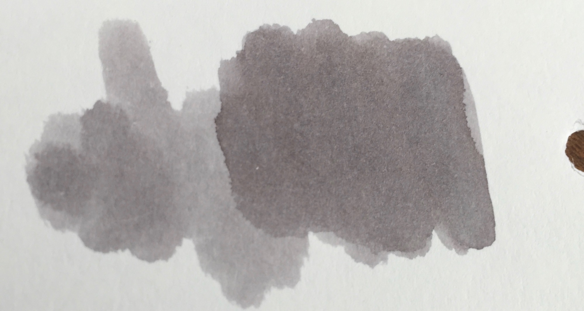
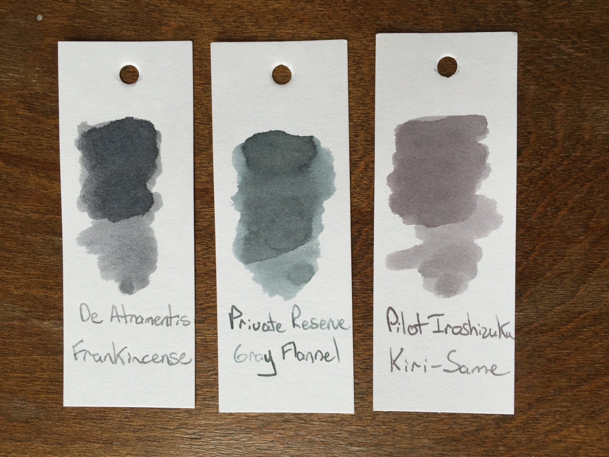
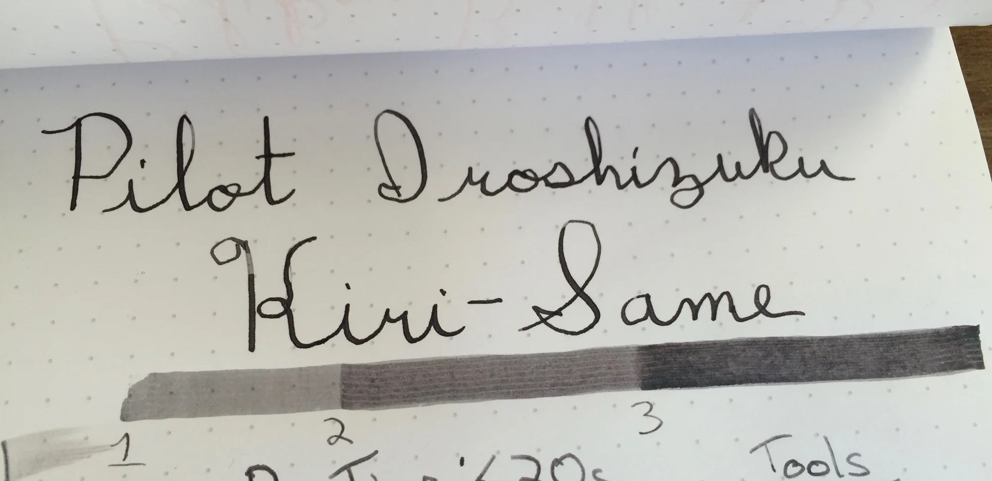
Although the winter weather has moved on, the skies are grey in the midwest this week. Grey skies always bring me back to blue and grey inks. Grey inks are my favorite shading inks, although I rarely have an opportunity to use them, and they're such an uncommon ink that they beg for a double-take when seen out in public. Although most grey inks shine in flex nibs, some of the darker inks can even be used in everyday writers, ensuring that their user has the coolest signature in the office. This week, I'm taking a look at Pilot Iroshizuku Kiri-Same ink, an ink that captures all of the best parts of grey skies and misty days.
Pilot Iroshizuku Kiri-Same is on the lighter side of the grey spectrum. Just like its namesake, Kiri-Same resembles the clouds that come along with a misty rain. The ink swatch itself resembles a cloud, lighter grey around the edges with deepening shades of grey towards the center.
Kiri-Same is dark enough to load into your favorite fine-nibbed pen, as long as the nib tends to leave a lot of ink on the page. Since the ink's shading properties are so high, dryer nibs leave a much lighter line than their juicier counterparts. Flex or calligraphy nibs are where this ink ink belongs, and it performs splendidly in either, leaving lines which show significant color variation.
Pilot Iroshizuku Kiri-Same may come at a price premium, but its performance is well worth the price hike. Kiri-Same has a relatively fast dry time, and its shading properties make for a great sketching or calligraphy ink. With Kiri-Same, grey skies and rainy days come alive on the page.
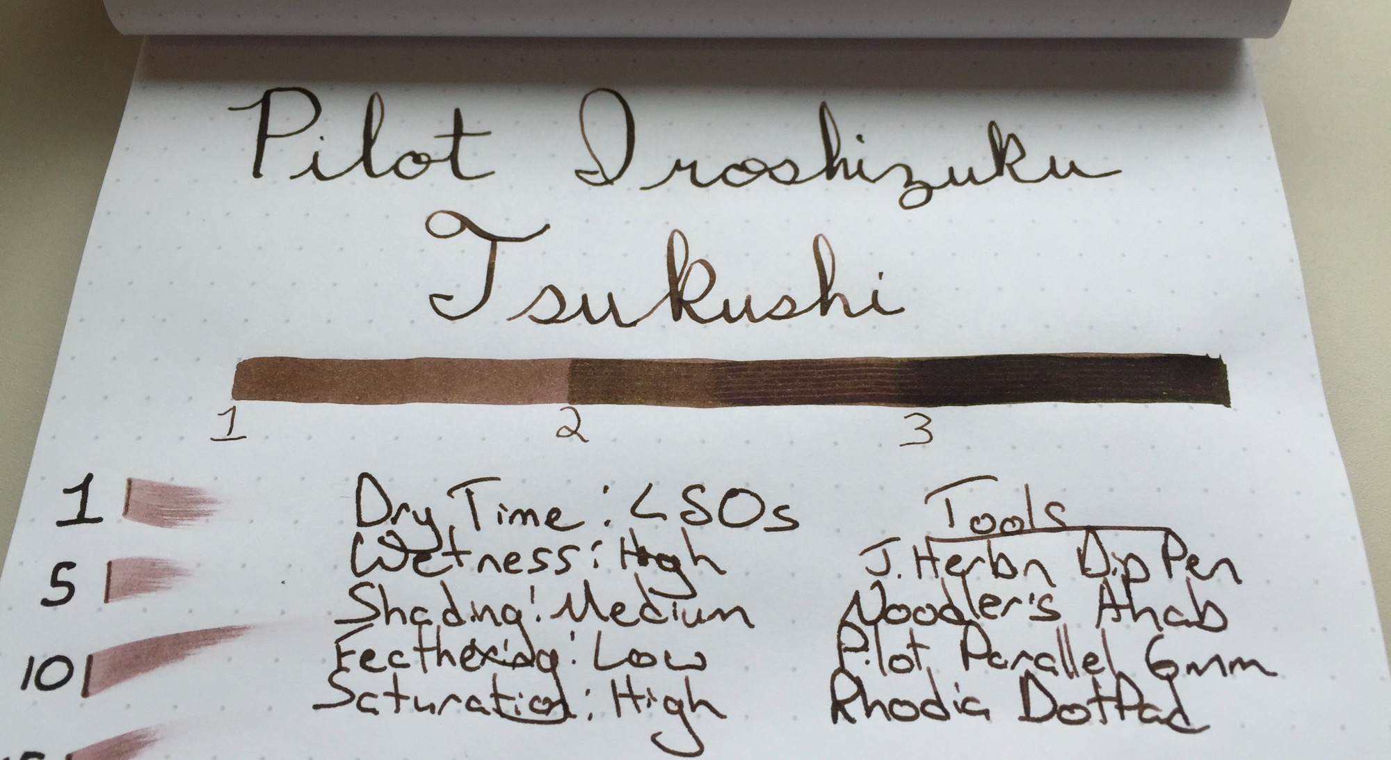
I can't help but smile when I come across a well-made Japanese product. I have flashbacks of subway rides and midnight karaoke sessions that are woven through memories of a friendly culture obsessed with quality and presentation. I open my Midori Traveler's Notebook or uncap a Pilot pen, and I'm reminded of this love for quality and subtle delights. This week I had the pleasure of testing Namiki Iroshizuku Tsukushi ink, a part of the Namiki Iroshizuku sampler pack. I found myself face to face with not only another example of a truly stellar Japanese product, but perhaps the best ink that I have ever used.
Tsukushi, or 土筆 is a Japanese Horsetail plant that's reddish brown in color. Since my experience with Japanese Horsetail is limited to a brief Google search, I would say that the ink reminds me of light-medium roasted coffee beans. Namiki Iroshizuku Tsukushi ink works well in nibs from fine to flex alike, and its shading properties further the coffee bean comparison, showing several layers of colors with subtle shades of red, similar to coffee beans in various stages of the roasting process.
Namiki Iroshizuku Tsukushi ink has a moderate dry time. It's worth noting that I test my inks with a J. Herbin Dip Pen, which tends to leave a line that is slightly thicker than that of a traditional fine nib. The ink dried in approximately 45 seconds with the dip pen, but performed somewhat better in my Lamy 2000, with a dry time of approximately 35 seconds. It's not the fastest drying ink around, but it shines in other areas. The ink shows a nice level of shading for such a dark color and performs extremely well with a flex nib. I just can't get over how wonderful this ink pops on the Rhodia DotPad, but I find that its appearance on Tomoe River paper, my daily writing paper, is even more dramatic.
The Namiki Iroshizuku Tsukushi's shading properties make it a great ink for a flex nib, but the ink really shines in my Lamy 2000. The ink lays down a dark brown line with shades of red, but the color mellows as it dries, leaving a lighter brown behind. There's just enough flex in my fine-nibbed Lamy 2000 to leave hints of shading in each letter. The result is lettering with colors that are dark and consistent enough to read but shaded just enough to catch the eye. The faint shades of red call to be inspected more closely.
I have a sample or two of other Iroshizuku inks that I have yet to try, so the Namiki Iroshizuku Tsukushi is my first real step into the world of premium Namiki inks. If the Tsukushi is any indication of the performance of the other inks in this line, I'll be purchasing a few bottles in the near future. The ink has a wonderful balance between shading performance and readability for thinner nibs. I've tested this ink in my Lamy 2000 for a day or two now, and it has proven worthy of replacing the Aurora Blue that I have been using for the last month or two. While black and blue may be safe choices for everyday writers, the Pilot Iroshizuku Tsukushi ink performs beautifully and is worthy of consideration for one of your edc pens. I'm surprised by just how well this ink performs across a wide range of nib sizes, and it's hard to find fault with such a consistently excellent ink. While Iroshizuku inks may be slightly more expensive, the difference in quality is leaps and bounds above the difference in price. If you haven't tried Iroshizuku inks before and want to see what they're all about, check out a sampler pack. If you're ready to take the Tsukushi dive, there are also full-sized bottles available.
Disclaimer: I received this ink free of charge for the purposes of this review. I was not compensated monetarily and all opinions posted here are my own.
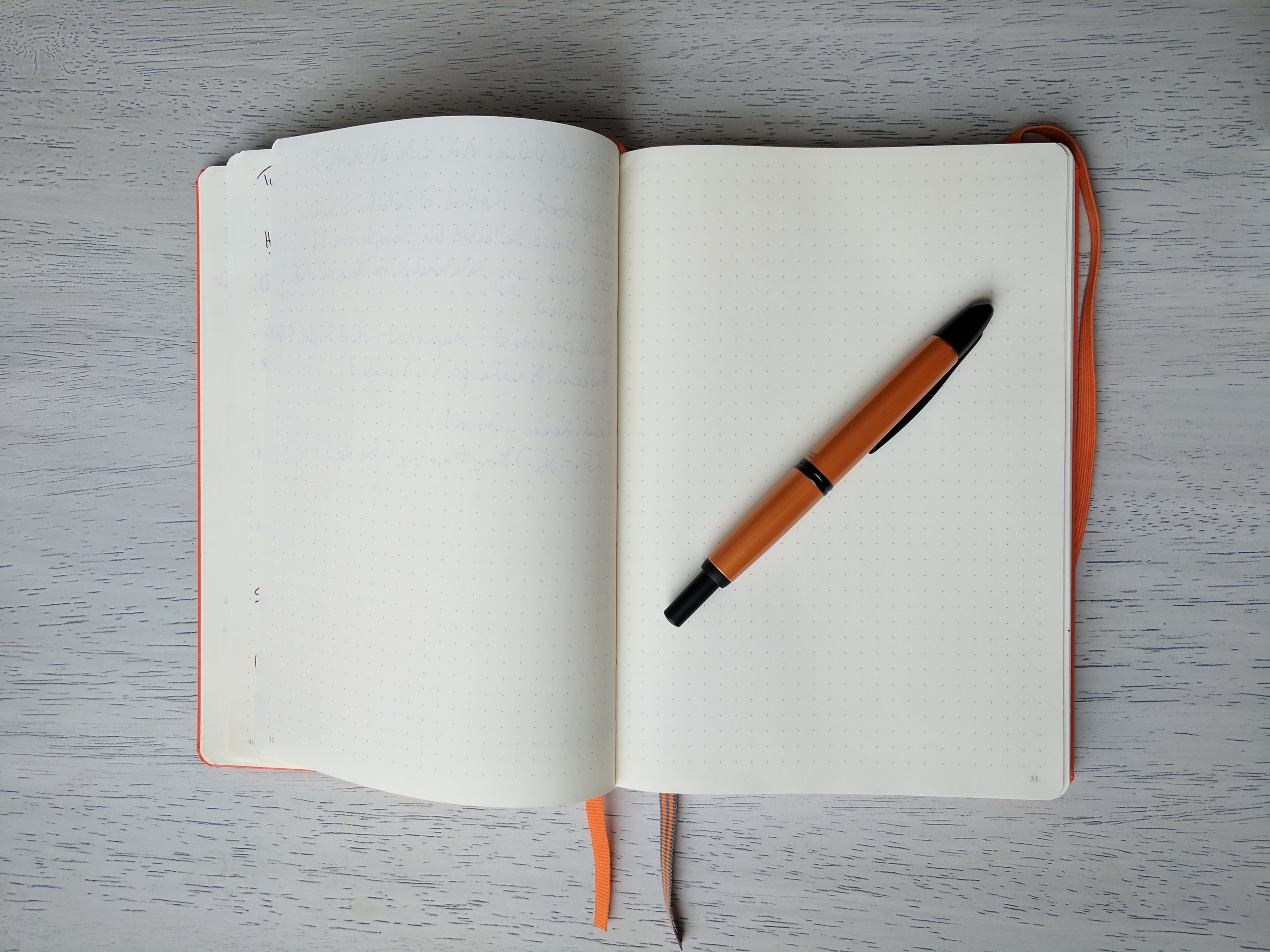
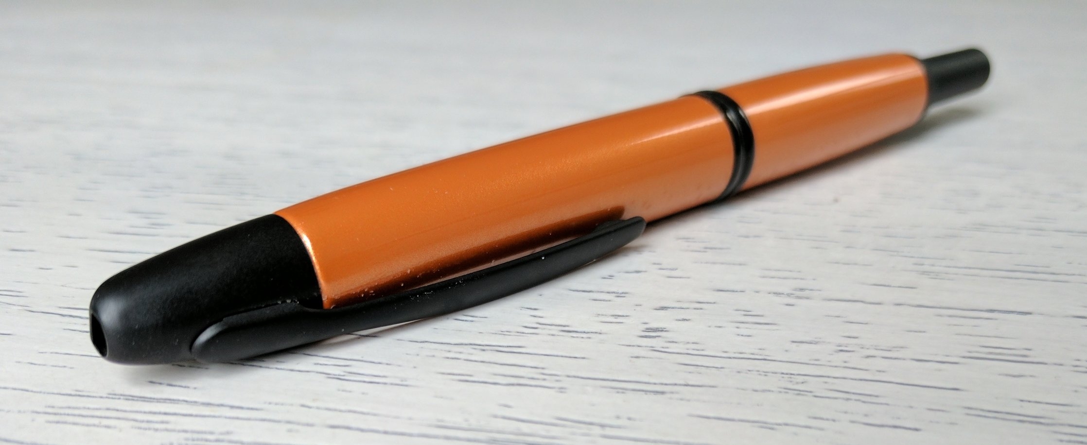
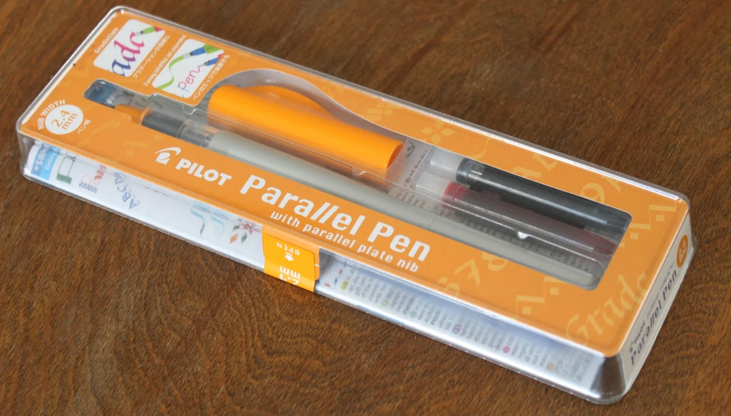
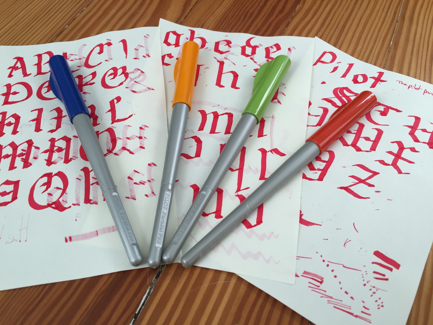
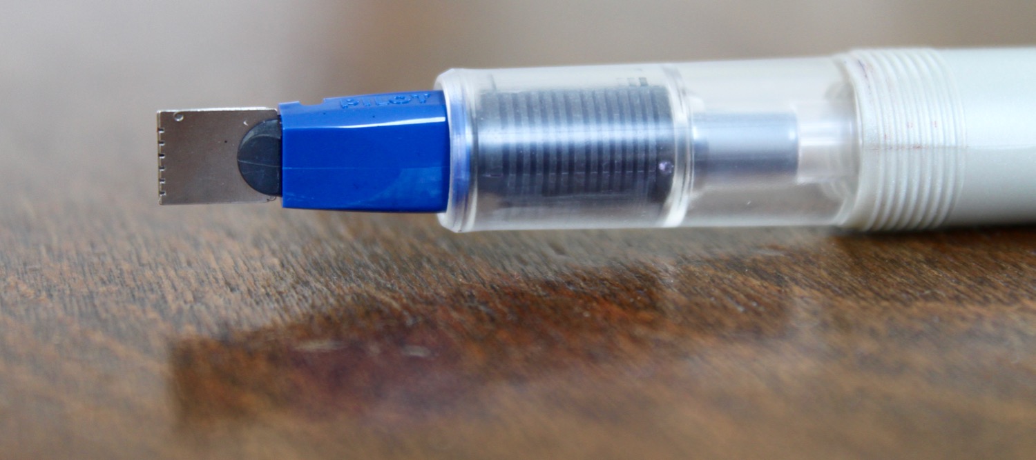
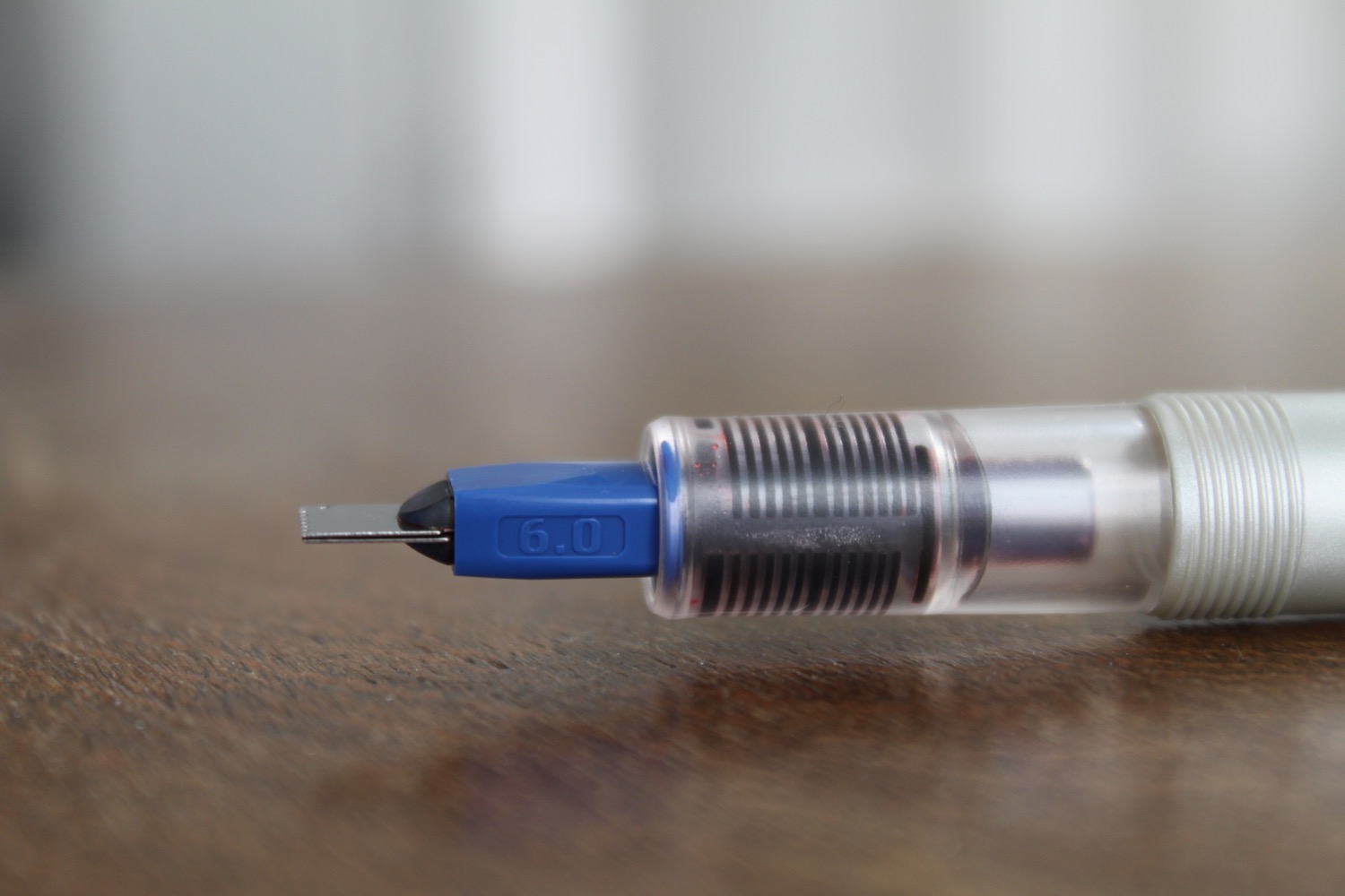
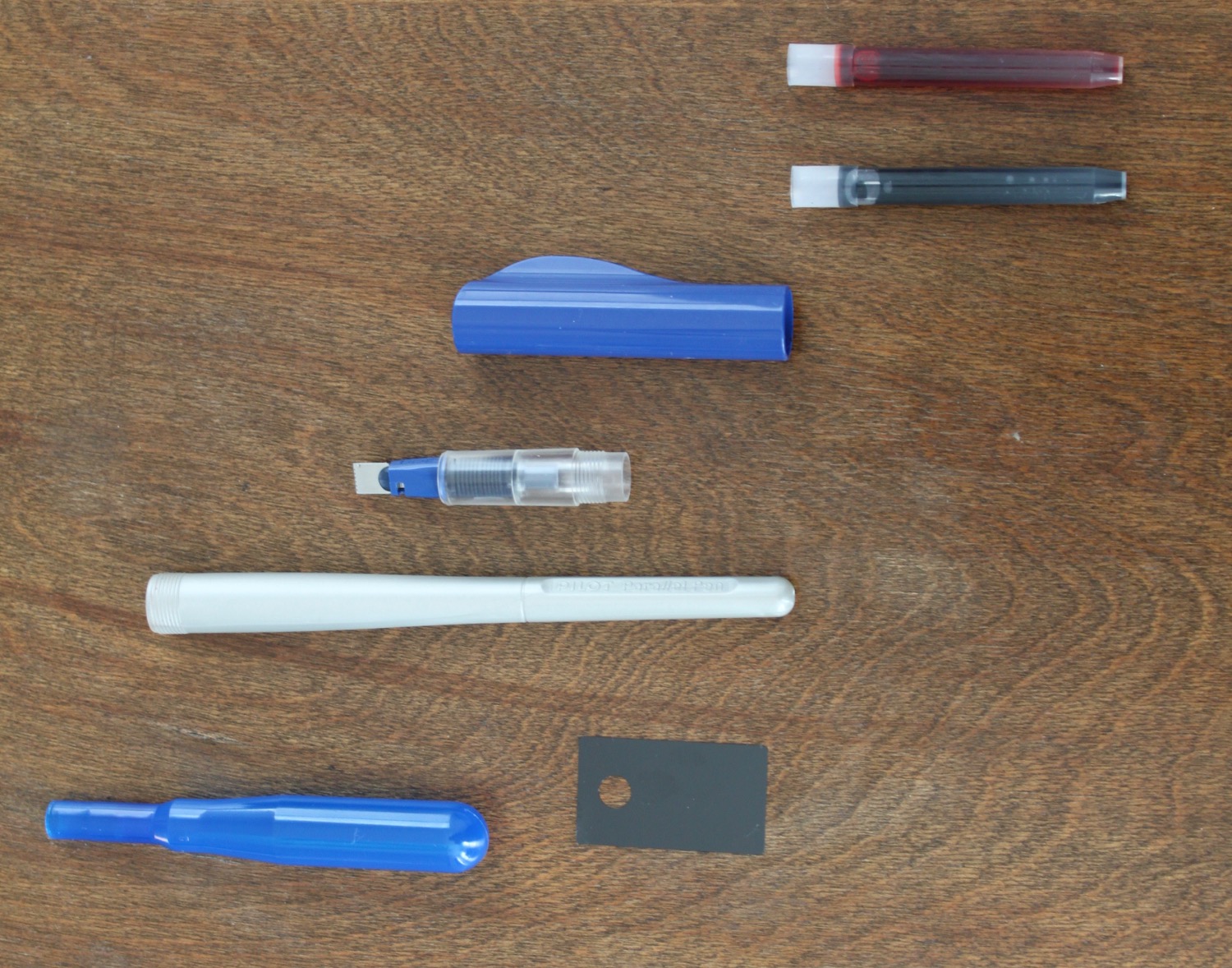
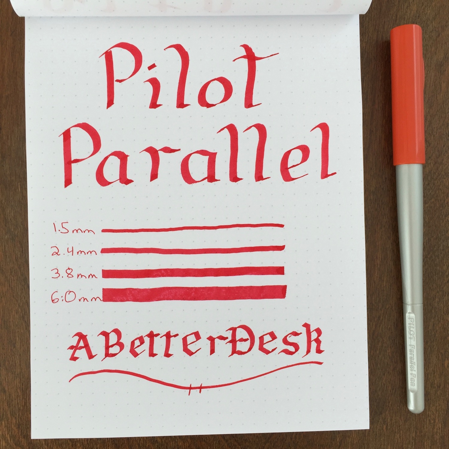
The Pilot Parallel is an inexpensive calligraphy pen that's great for getting started with calligraphy without spending a small fortune. I stumbled upon these pens while looking for a cheap pen for testing inks, and they are exactly what I was looking for. The full Pilot Parallel pen set can be found for less that $30 on Amazon and comes with four pens with 1.5, 2.4, 3.8, and 6mm nib sizes.
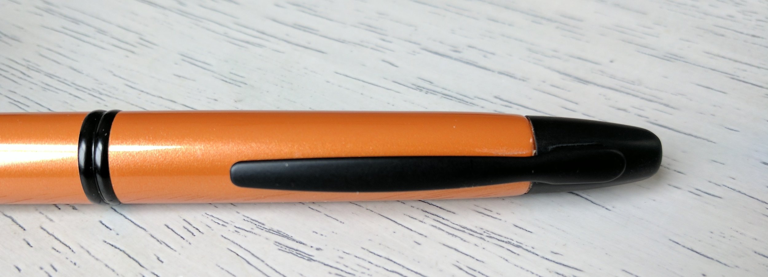
Each Pilot Parallel pen comes with two mixable ink cartridges, a nib cleaner, bulb syringe for cleaning, and calligraphy guide. The pen is made of plastic and twists apart for easy ink cartridge replacement, like most standard cartridge fountain pens. The Parallel's cap is threaded and caps securely. Its very lightweight plastic body lacks a clip and resembles a paintbrush handle. The pen looks and feels like a $10 pen, but its performance makes up for the cheap first impressions.
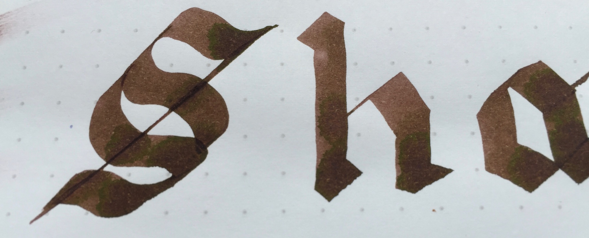
The nib of the Pilot Parallel is easily the most interesting part of the pen. The nib is made of two parallel plates, with serrated edges that allow ink to flow out of the tip of the nib. This varies from the standard fountain pen nib design, where the nib sits atop an ink feed that keeps the nib inked. It takes a bit of coaxing to get the ink to flow through the Parallel's feed at first, but the transparent feed gives a good indication of the ink's progress as it approaches the nib. I typically have to tap the nib on paper to get the ink flowing through all of the nib slits, but flow is steady once it gets going.
Pilot states that its Parallel pen is only to be used with the included calligraphy inks, which are very wet. I bought the pens for ink testing, so I was relieved to find that they work with with standard fountain pen inks as well. Wetter inks perform the most consistently, and dryer inks take a bit work to get them to flow through the nib. These pens lay a ton of ink on the page, so be sure to use a higher quality paper to reduce ink feathering. This also means that the pens burn through ink very quickly.
Instead of wasting money on a Pilot converter, I reuse the empty Parallel ink cartridges. These hold a large amount of ink and have a ball bearing agitator that keeps ink from building up in the tip of the cartridge. The cartridges are very easy to clean by flushing with a standard medical syringe. The Pilot Parallel can also be converted to an eye dropper filler with a huge ink capacity, since the body of the pen is sealed. I'm still not brave enough to try this, but it should be fairly easy to do by filling the pen body with ink and adding a bit of silicon grease to the threads for a good seal.
The Pilot Parallel comes with a sheet for cleaning the grooves of the nib as well as a customized bulb syringe for cleaning. The pens takes substantial flushing to clean, but the provided tools really help make the process easier.
I initially purchased a set of Pilot Parallel pens for ink testing, but I find myself dabbling more and more with calligraphy. These pens are a lot of fun to use and are so inexpensive that I have no qualms about throwing the pens in my bag or playing around with different inks. The 2.4mm pen is my favorite of the bunch, and the nib is just the right size for my A5 Rhodia DotPad and Midori Traveler's Notebook. The Pilot Parallel Calligraphy Pen is a fantastic find, and I'm glad that I gave it a shot.