I can't help but smile when I come across a well-made Japanese product. I have flashbacks of subway rides and midnight karaoke sessions that are woven through memories of a friendly culture obsessed with quality and presentation. I open my Midori Traveler's Notebook or uncap a Pilot pen, and I'm reminded of this love for quality and subtle delights. This week I had the pleasure of testing Namiki Iroshizuku Tsukushi ink, a part of the Namiki Iroshizuku sampler pack. I found myself face to face with not only another example of a truly stellar Japanese product, but perhaps the best ink that I have ever used.
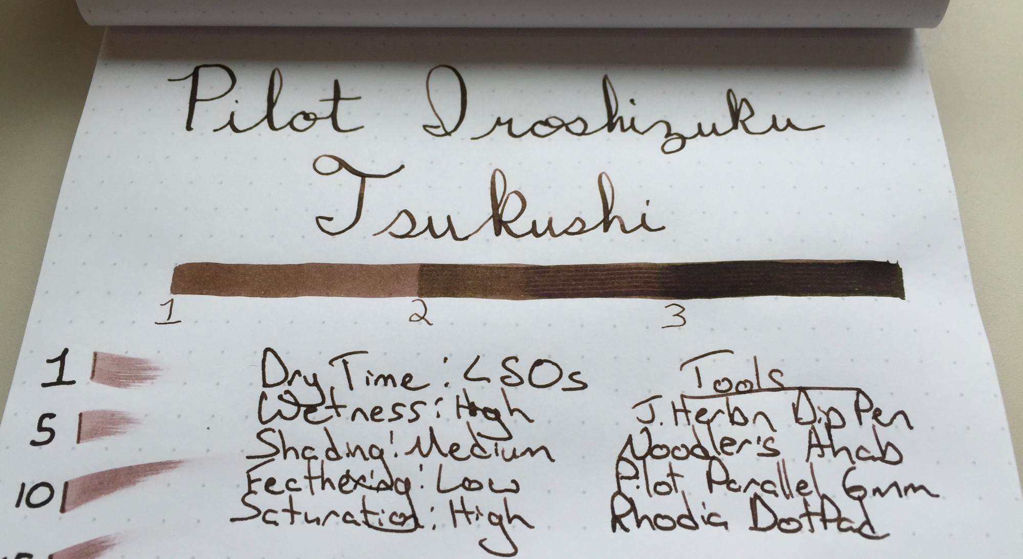
Tsukushi, or 土筆 is a Japanese Horsetail plant that's reddish brown in color. Since my experience with Japanese Horsetail is limited to a brief Google search, I would say that the ink reminds me of light-medium roasted coffee beans. Namiki Iroshizuku Tsukushi ink works well in nibs from fine to flex alike, and its shading properties further the coffee bean comparison, showing several layers of colors with subtle shades of red, similar to coffee beans in various stages of the roasting process.
Namiki Iroshizuku Tsukushi ink has a moderate dry time. It's worth noting that I test my inks with a J. Herbin Dip Pen, which tends to leave a line that is slightly thicker than that of a traditional fine nib. The ink dried in approximately 45 seconds with the dip pen, but performed somewhat better in my Lamy 2000, with a dry time of approximately 35 seconds. It's not the fastest drying ink around, but it shines in other areas. The ink shows a nice level of shading for such a dark color and performs extremely well with a flex nib. I just can't get over how wonderful this ink pops on the Rhodia DotPad, but I find that its appearance on Tomoe River paper, my daily writing paper, is even more dramatic.
The Namiki Iroshizuku Tsukushi's shading properties make it a great ink for a flex nib, but the ink really shines in my Lamy 2000. The ink lays down a dark brown line with shades of red, but the color mellows as it dries, leaving a lighter brown behind. There's just enough flex in my fine-nibbed Lamy 2000 to leave hints of shading in each letter. The result is lettering with colors that are dark and consistent enough to read but shaded just enough to catch the eye. The faint shades of red call to be inspected more closely.
I have a sample or two of other Iroshizuku inks that I have yet to try, so the Namiki Iroshizuku Tsukushi is my first real step into the world of premium Namiki inks. If the Tsukushi is any indication of the performance of the other inks in this line, I'll be purchasing a few bottles in the near future. The ink has a wonderful balance between shading performance and readability for thinner nibs. I've tested this ink in my Lamy 2000 for a day or two now, and it has proven worthy of replacing the Aurora Blue that I have been using for the last month or two. While black and blue may be safe choices for everyday writers, the Pilot Iroshizuku Tsukushi ink performs beautifully and is worthy of consideration for one of your edc pens. I'm surprised by just how well this ink performs across a wide range of nib sizes, and it's hard to find fault with such a consistently excellent ink. While Iroshizuku inks may be slightly more expensive, the difference in quality is leaps and bounds above the difference in price. If you haven't tried Iroshizuku inks before and want to see what they're all about, check out a sampler pack. If you're ready to take the Tsukushi dive, there are also full-sized bottles available.
Disclaimer: I received this ink free of charge for the purposes of this review. I was not compensated monetarily and all opinions posted here are my own.
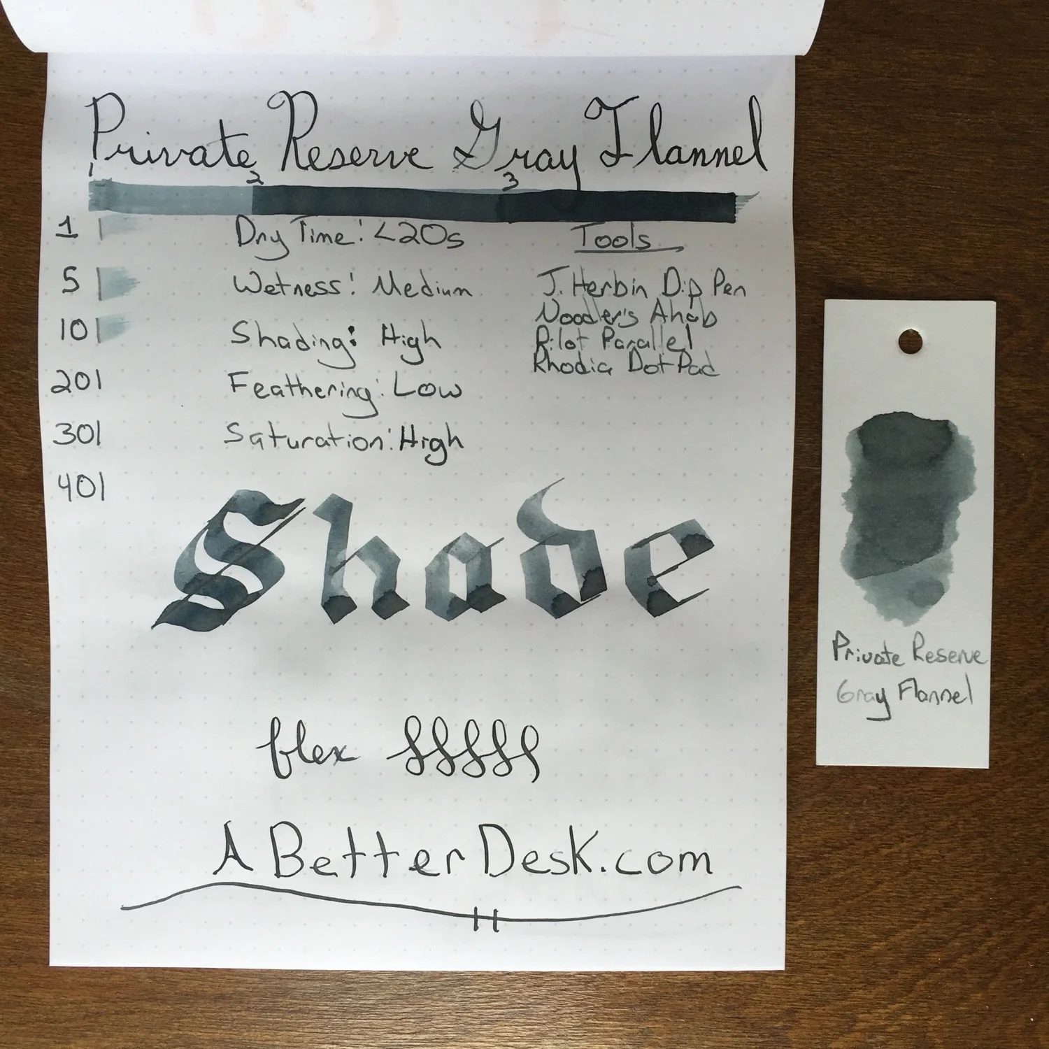
A wintery blizzard consumed the east coast this weekend. As I sat, wrapped in a blanket with the space heater on full blast, I thought that it would be a great week to try out a few gray inks. I didn't understand the appeal of such inks, since they are often too light to use with traditional fine nibs and seemed to be impractical, but I was pleasantly surprised when I put a few inks through their paces. I settled on Private Reserve Gray Flannel to review simply, due to its awesome name and shading properties.
Private Reserve Gray Flannel Ink has the most extreme shading properties of the three gray inks that I've tried so far. Although I only swipe ink swatches twice, the Gray Flannel Ink showed multiple shades of gray, unlike the De Atramentis Frankincense and Pilot Iroshizuku. The variation of shading with my Pilot Parallel pen was so extreme that the ink seemed to shimmer on the page.
Private Reserve Gray Flannel Ink has fantastic shading properties, dark enough to be legible with a standard fine nib and is relatively inexpensive, compared to its competitors. Although I hadn't considered using a grey ink in the past, Gray Flannel is a lot of fun to use with my Noodler's Ahab Flex and Pilot Parallel Calligraphy pens. The ink's dry time is reasonably fast, and its name is also my favorite of the gray bunch.
Note: I switched to using a glass dip pen instead of the Lamy Safari to test ink dry times starting with this review. Dry times may not compare equally with previous ink reviews. The dip pen is much easier to clean than the Safari, so I plan to use it for all future ink reviews.
Every teacher needs a red pen. Although most of my grading is now done in the digital world, I still mark up a few paper assignments every week. Why red? Most students believe that teachers use red to instill fear and anguish, but the truth is that bright colors, such as red, make it easier to pick out corrections and comments amidst a sea of black. Diamine Pumpkin is my favorite fall choice for grading papers, but I needed a new color suitable for the changing seasons.
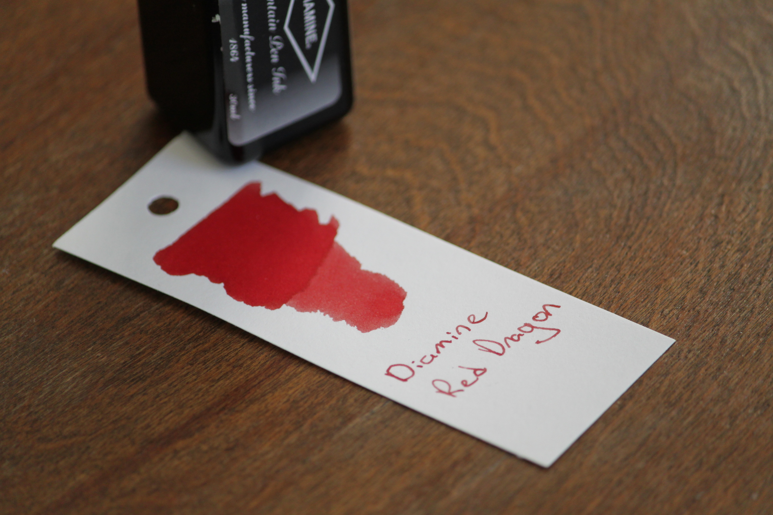
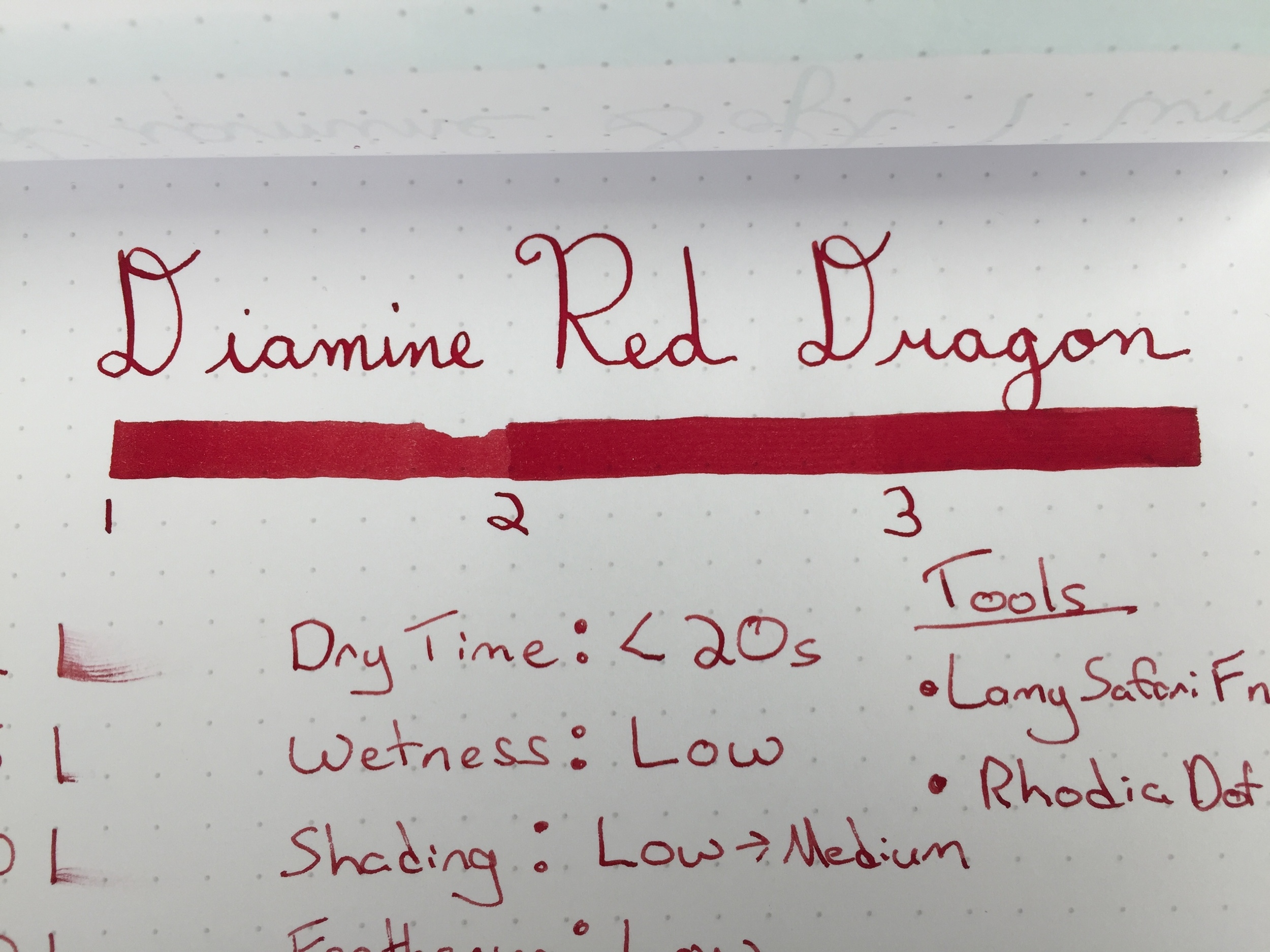
I ventured out in search of the perfect red to fill my TWSBI 580 and settled on Diamine Red Dragon fountain pen ink. It wasnt't the bright ink that I was looking for, but I loved how Red Dragon looked on ink swatches online. The color resembles that of dried blood, with shades of brown. Even though I appreciate the evil villain feel that the ink provides, I love its deep color for everyday writing.
I am very happy with Diamine Red Dragon and have it inked up daily. Dry time is adequate, but I would rate its feathering performance as "medium". Even though I rated feathering as "low" in my handwritten review, further use revealed that this ink performs worse than most of my other inks on cheaper papers. I typically use Red Dragon on student assignments printed on cheap copy paper, and it feathers badly. Plan to use this ink with a nicer pad of paper. Despite the fact that this is not the perfect grading ink that I've been looking for, Diamine Red Dragon's deep color is too beautiful to let go of for now. If you know of any similar inks that perform well on cheap paper, please leave a comment below!
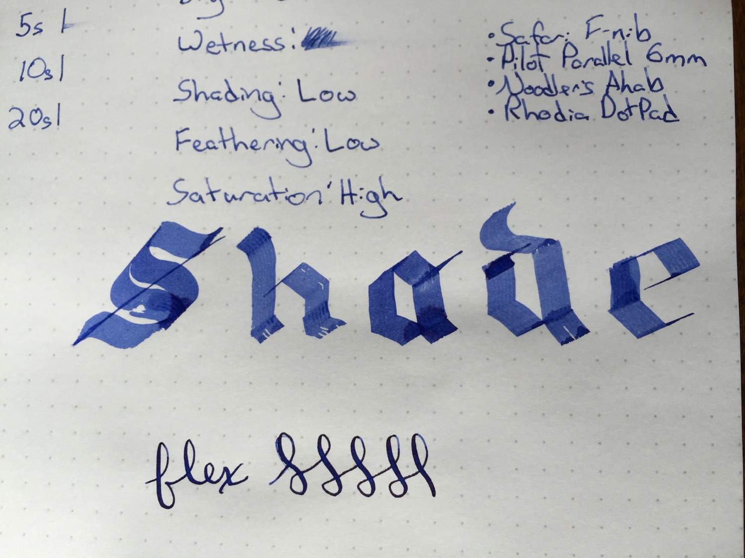
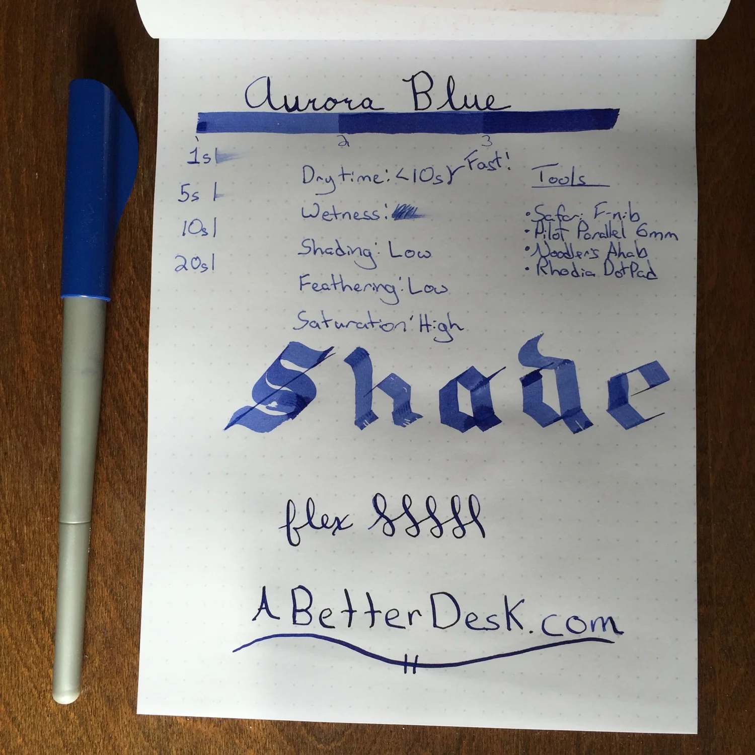
Blue is the perfect color with which to welcome the winter winds. Lamy blue/black ink cartridges have been the only blue in my arsenal, but November's Ink Drop brought an icy alternative to my door.
Aurora Blue is a beautiful deep blue ink, and its color deepens in intensity with every pass of the pen. I've been looking for an everyday blue bottled ink, and I think that this may be the ink for me. I use the Tomoe River Paper Midori refill as my primary notebook, and this paper has a notoriously long dry time. The benefits of using this paper outweigh the cons, but this means that I need inks with the best drying performance possible. I struggle with the slow dry time of my goto Diamine Onyx Black, so I'm pleasantly surprised to see that Aurora Blue has much better dry time than Onyx Black. Goulet Pens lists Aurora Blue ink as having a very slow dry time, but I found the opposite to be true. I did notice that it took a few minutes for the ink to dry with my Noodler's Ahab flex pen; however, dry time with the Lamy Safari F nib was less than 10 seconds for several different paper types. Dry time was less than 20 seconds on the Tomoe River paper, which is incredibly fast, compared to other inks.
I plan to load my sample of Aurora Blue into my Lamy 2000 and give it a go as my primary ink for the next few weeks. It's just that good.
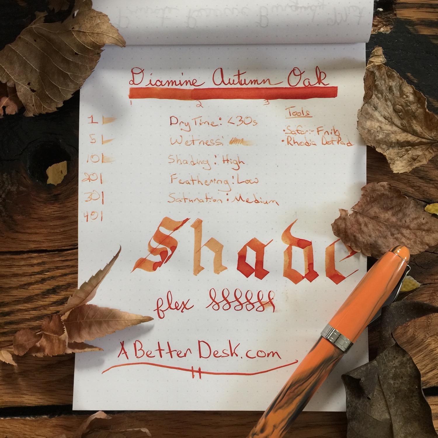
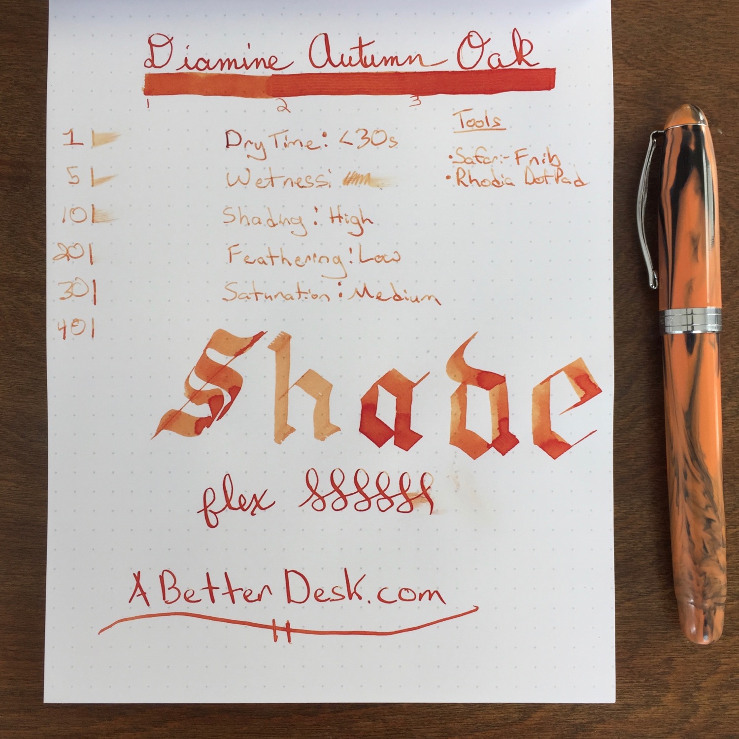
The leaves are falling from the trees and cold weather is moving in. Thanksgiving is all that remains between fall and the blustery winds of winter. Before we bid fall adieu, let's celebrate its fading glory with one final fall ink review. Diamine Autumn Oak is a mellow orange ink with excellent shading properties. The color resembles that of an autumn leaf, with shades of orange and brown.
Autumn Oak is relatively dry and has a moderate dry time of slightly more than 20 seconds. The ink is all about shade, and Autumn Oak has the best shading properties of any ink that I've tried so far. It works best with wider nibs or flex nibs which show off the ink's shading properties. Autumn Oak can be used in finer nibs, but it's a bit too light to use as a daily workhorse ink, unless the nib is really juicy. Autumn Oak has medium saturation, with little distinction between the second and third bar in the ink test.
Diamine Pumpkin is my favorite orange to date, and its low shading and vivid color make it worthy of always being inked up. Compared to Pumpkin, Diamine Autumn Oak is much lighter on the page and leans closer towards brown. Pumpkin resembles the bright leaves at the beginning of fall, while Autumn Oak shows off the orangy browns of leaves that have fallen from the trees.
Diamine Autumn Oak isn't something that I would keep inked up all the time, but the ink's phenomenal shading properties and color make it a worthy addition to any ink collection.