Although the winter weather has moved on, the skies are grey in the midwest this week. Grey skies always bring me back to blue and grey inks. Grey inks are my favorite shading inks, although I rarely have an opportunity to use them, and they're such an uncommon ink that they beg for a double-take when seen out in public. Although most grey inks shine in flex nibs, some of the darker inks can even be used in everyday writers, ensuring that their user has the coolest signature in the office. This week, I'm taking a look at Pilot Iroshizuku Kiri-Same ink, an ink that captures all of the best parts of grey skies and misty days.
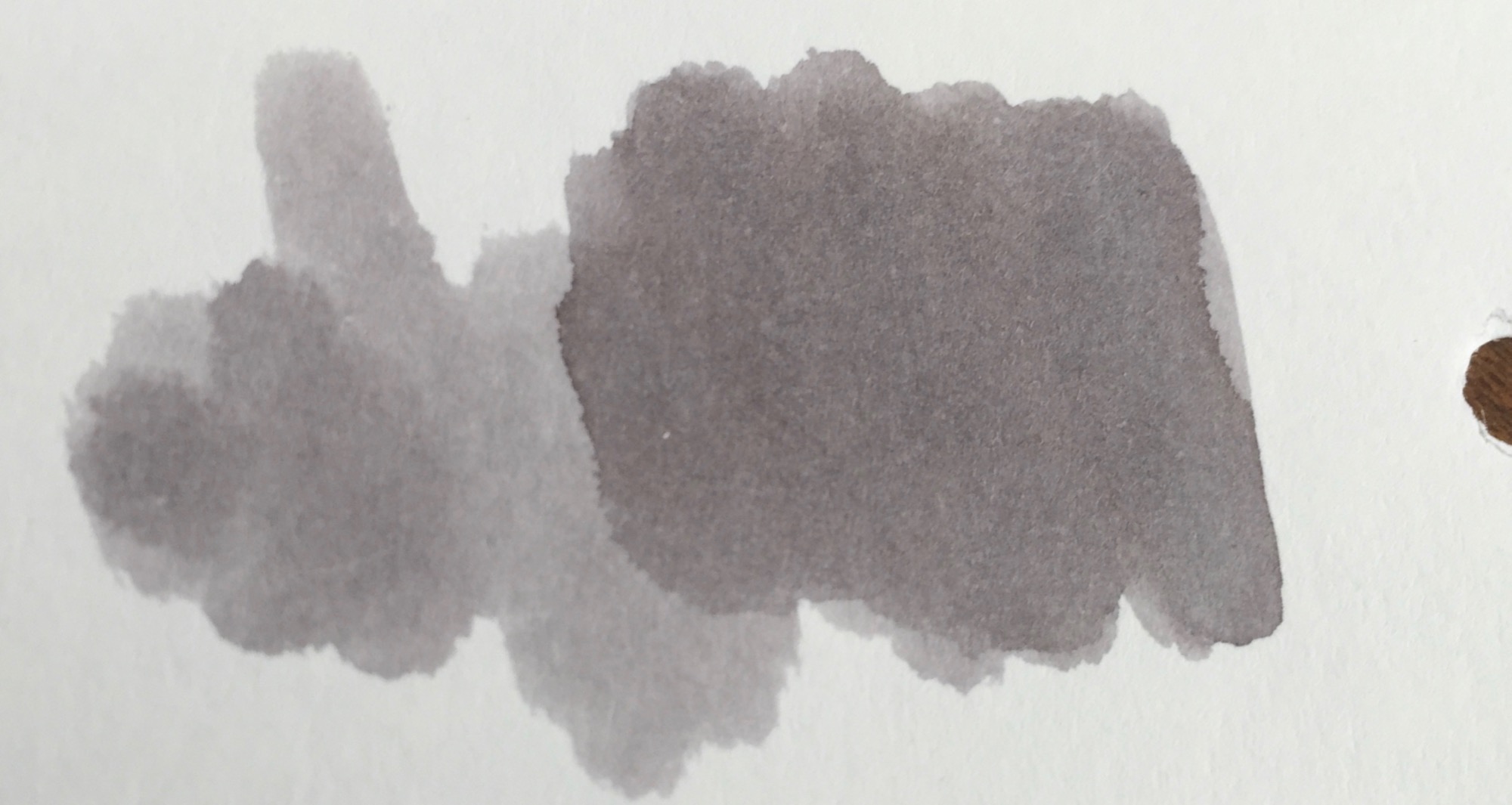
Pilot Iroshizuku Kiri-Same is on the lighter side of the grey spectrum. Just like its namesake, Kiri-Same resembles the clouds that come along with a misty rain. The ink swatch itself resembles a cloud, lighter grey around the edges with deepening shades of grey towards the center.
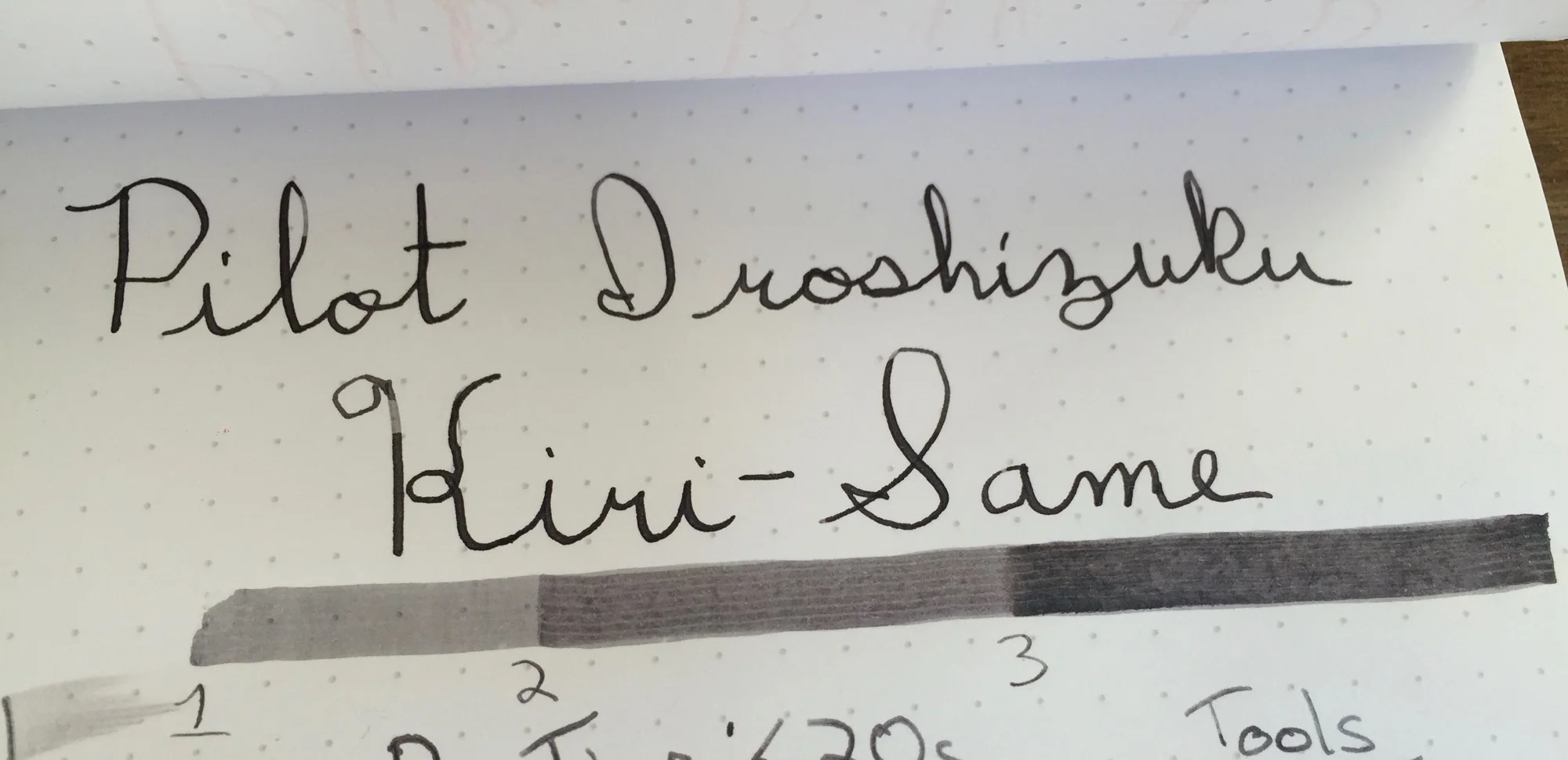
Kiri-Same is dark enough to load into your favorite fine-nibbed pen, as long as the nib tends to leave a lot of ink on the page. Since the ink's shading properties are so high, dryer nibs leave a much lighter line than their juicier counterparts. Flex or calligraphy nibs are where this ink ink belongs, and it performs splendidly in either, leaving lines which show significant color variation.
Pilot Iroshizuku Kiri-Same may come at a price premium, but its performance is well worth the price hike. Kiri-Same has a relatively fast dry time, and its shading properties make for a great sketching or calligraphy ink. With Kiri-Same, grey skies and rainy days come alive on the page.
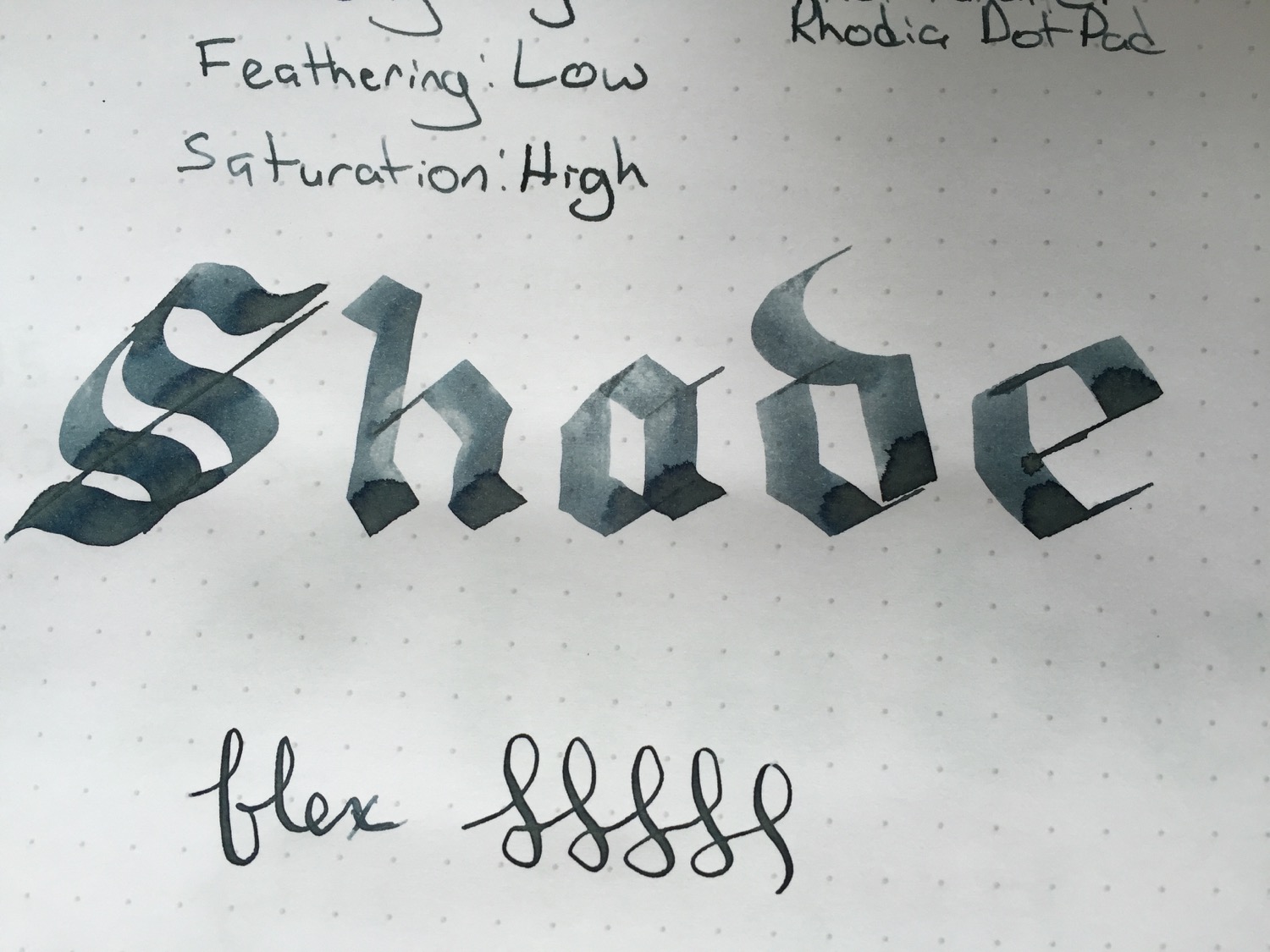
Stats
- Dry Time: Less than 20s
- Wetness: Medium
- Shading: High
- Feathering: Low
- Saturation: High
Tools
Like this post?
Subscribe to our rss feed or
follow us on Twitter and receive new post updates automatically.
A wintery blizzard consumed the east coast this weekend. As I sat, wrapped in a blanket with the space heater on full blast, I thought that it would be a great week to try out a few gray inks. I didn't understand the appeal of such inks, since they are often too light to use with traditional fine nibs and seemed to be impractical, but I was pleasantly surprised when I put a few inks through their paces. I settled on Private Reserve Gray Flannel to review simply, due to its awesome name and shading properties.
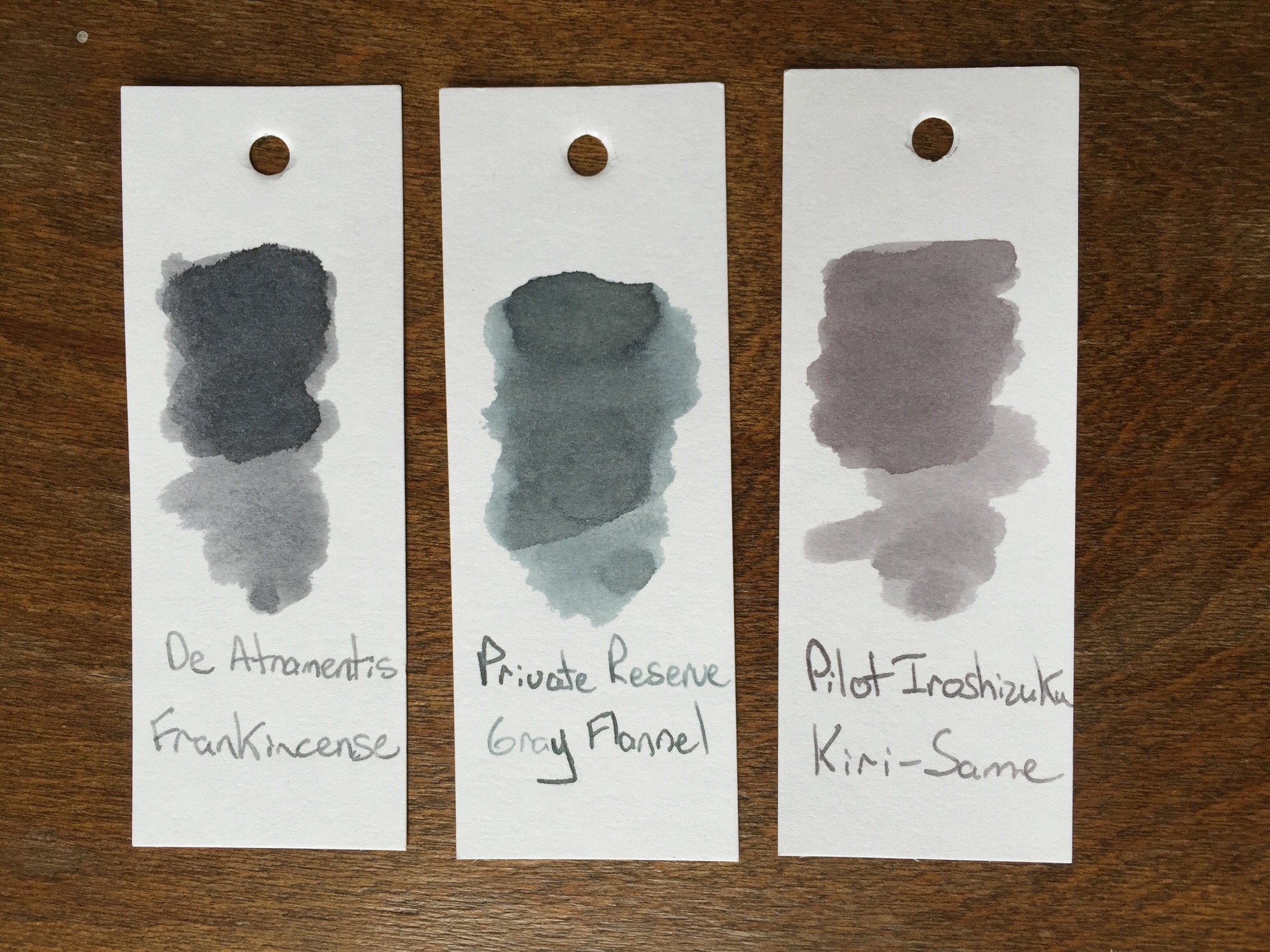
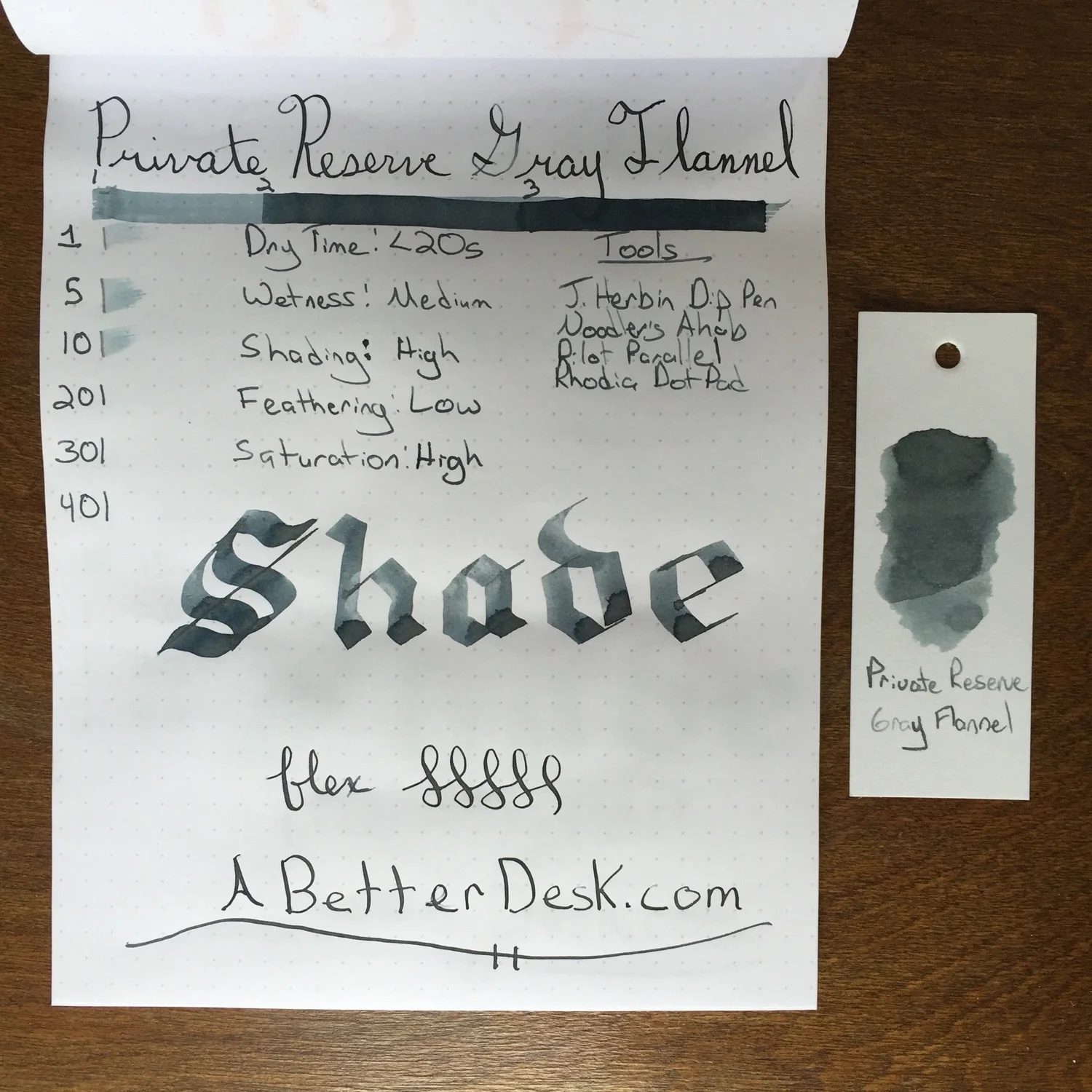
Private Reserve Gray Flannel Ink has the most extreme shading properties of the three gray inks that I've tried so far. Although I only swipe ink swatches twice, the Gray Flannel Ink showed multiple shades of gray, unlike the De Atramentis Frankincense and Pilot Iroshizuku. The variation of shading with my Pilot Parallel pen was so extreme that the ink seemed to shimmer on the page.
Private Reserve Gray Flannel Ink has fantastic shading properties, dark enough to be legible with a standard fine nib and is relatively inexpensive, compared to its competitors. Although I hadn't considered using a grey ink in the past, Gray Flannel is a lot of fun to use with my Noodler's Ahab Flex and Pilot Parallel Calligraphy pens. The ink's dry time is reasonably fast, and its name is also my favorite of the gray bunch.
Stats
- Dry Time: Less than 20s
- Wetness: Medium
- Shading: High
- Feathering: Low
- Saturation: High
Tools
Note: I switched to using a glass dip pen instead of the Lamy Safari to test ink dry times starting with this review. Dry times may not compare equally with previous ink reviews. The dip pen is much easier to clean than the Safari, so I plan to use it for all future ink reviews.
Like this post?
Subscribe to our rss feed or
follow us on Twitter and receive new post updates automatically.