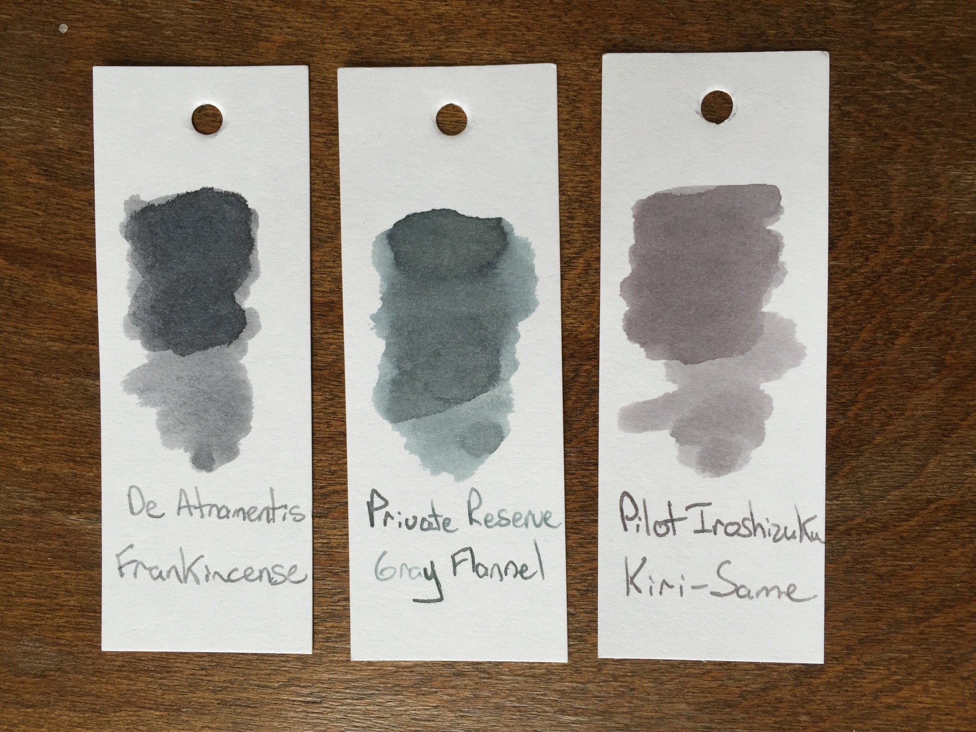
Although the winter weather has moved on, the skies are grey in the midwest this week. Grey skies always bring me back to blue and grey inks. Grey inks are my favorite shading inks, although I rarely have an opportunity to use them, and they're such an uncommon ink that they beg for a double-take when seen out in public. Although most grey inks shine in flex nibs, some of the darker inks can even be used in everyday writers, ensuring that their user has the coolest signature in the office. This week, I'm taking a look at Pilot Iroshizuku Kiri-Same ink, an ink that captures all of the best parts of grey skies and misty days.
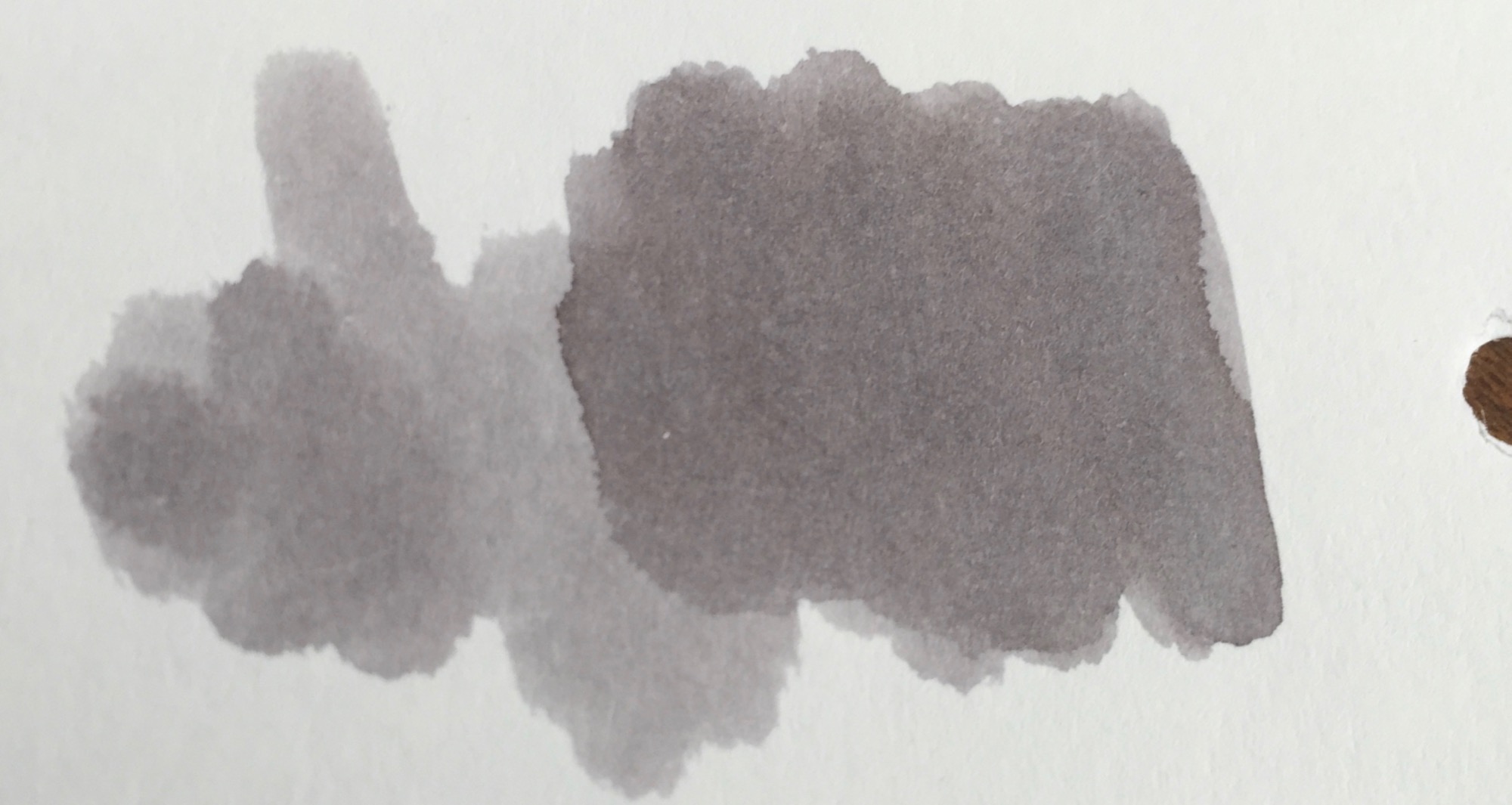
Pilot Iroshizuku Kiri-Same is on the lighter side of the grey spectrum. Just like its namesake, Kiri-Same resembles the clouds that come along with a misty rain. The ink swatch itself resembles a cloud, lighter grey around the edges with deepening shades of grey towards the center.
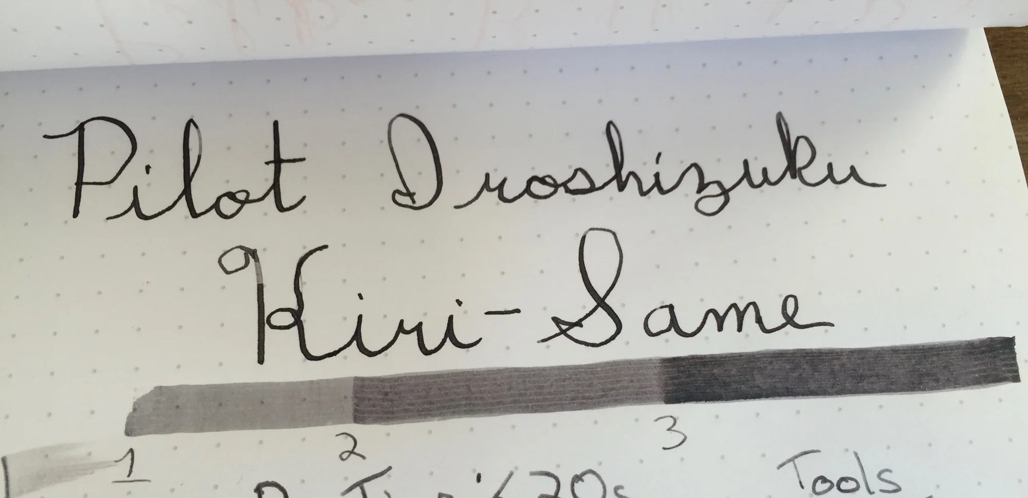
Kiri-Same is dark enough to load into your favorite fine-nibbed pen, as long as the nib tends to leave a lot of ink on the page. Since the ink's shading properties are so high, dryer nibs leave a much lighter line than their juicier counterparts. Flex or calligraphy nibs are where this ink ink belongs, and it performs splendidly in either, leaving lines which show significant color variation.
Pilot Iroshizuku Kiri-Same may come at a price premium, but its performance is well worth the price hike. Kiri-Same has a relatively fast dry time, and its shading properties make for a great sketching or calligraphy ink. With Kiri-Same, grey skies and rainy days come alive on the page.
Stats
- Dry Time: Less than 20s
- Wetness: Medium
- Shading: High
- Feathering: Low
- Saturation: High
Tools
Like this post?
Subscribe to our rss feed or
follow us on Twitter and receive new post updates automatically.
I can't help but smile when I come across a well-made Japanese product. I have flashbacks of subway rides and midnight karaoke sessions that are woven through memories of a friendly culture obsessed with quality and presentation. I open my Midori Traveler's Notebook or uncap a Pilot pen, and I'm reminded of this love for quality and subtle delights. This week I had the pleasure of testing Namiki Iroshizuku Tsukushi ink, a part of the Namiki Iroshizuku sampler pack. I found myself face to face with not only another example of a truly stellar Japanese product, but perhaps the best ink that I have ever used.
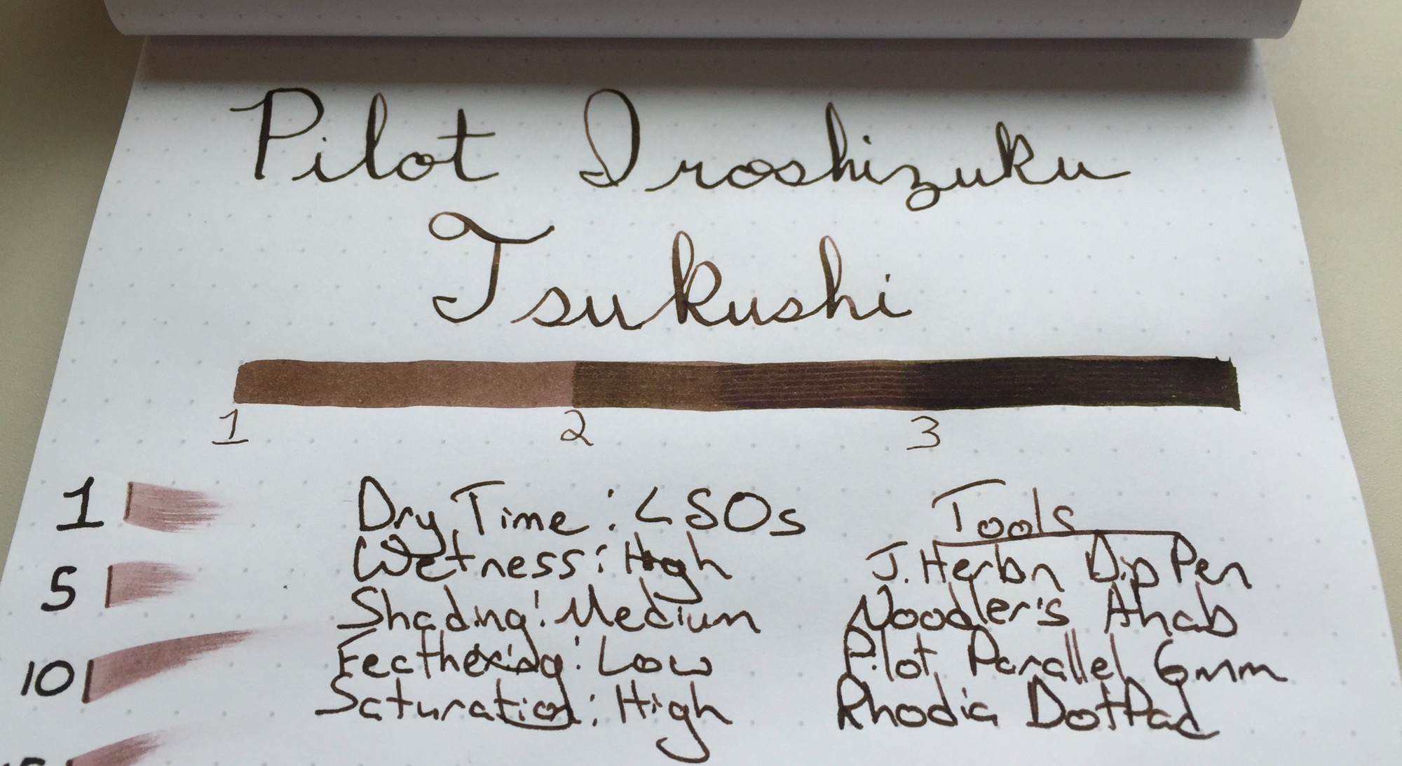
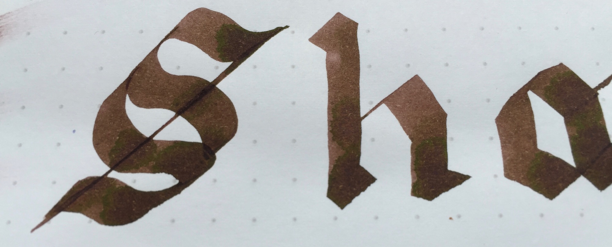
Tsukushi, or 土筆 is a Japanese Horsetail plant that's reddish brown in color. Since my experience with Japanese Horsetail is limited to a brief Google search, I would say that the ink reminds me of light-medium roasted coffee beans. Namiki Iroshizuku Tsukushi ink works well in nibs from fine to flex alike, and its shading properties further the coffee bean comparison, showing several layers of colors with subtle shades of red, similar to coffee beans in various stages of the roasting process.
Namiki Iroshizuku Tsukushi ink has a moderate dry time. It's worth noting that I test my inks with a J. Herbin Dip Pen, which tends to leave a line that is slightly thicker than that of a traditional fine nib. The ink dried in approximately 45 seconds with the dip pen, but performed somewhat better in my Lamy 2000, with a dry time of approximately 35 seconds. It's not the fastest drying ink around, but it shines in other areas. The ink shows a nice level of shading for such a dark color and performs extremely well with a flex nib. I just can't get over how wonderful this ink pops on the Rhodia DotPad, but I find that its appearance on Tomoe River paper, my daily writing paper, is even more dramatic.
The Namiki Iroshizuku Tsukushi's shading properties make it a great ink for a flex nib, but the ink really shines in my Lamy 2000. The ink lays down a dark brown line with shades of red, but the color mellows as it dries, leaving a lighter brown behind. There's just enough flex in my fine-nibbed Lamy 2000 to leave hints of shading in each letter. The result is lettering with colors that are dark and consistent enough to read but shaded just enough to catch the eye. The faint shades of red call to be inspected more closely.
I have a sample or two of other Iroshizuku inks that I have yet to try, so the Namiki Iroshizuku Tsukushi is my first real step into the world of premium Namiki inks. If the Tsukushi is any indication of the performance of the other inks in this line, I'll be purchasing a few bottles in the near future. The ink has a wonderful balance between shading performance and readability for thinner nibs. I've tested this ink in my Lamy 2000 for a day or two now, and it has proven worthy of replacing the Aurora Blue that I have been using for the last month or two. While black and blue may be safe choices for everyday writers, the Pilot Iroshizuku Tsukushi ink performs beautifully and is worthy of consideration for one of your edc pens. I'm surprised by just how well this ink performs across a wide range of nib sizes, and it's hard to find fault with such a consistently excellent ink. While Iroshizuku inks may be slightly more expensive, the difference in quality is leaps and bounds above the difference in price. If you haven't tried Iroshizuku inks before and want to see what they're all about, check out a sampler pack. If you're ready to take the Tsukushi dive, there are also full-sized bottles available.
Disclaimer: I received this ink free of charge for the purposes of this review. I was not compensated monetarily and all opinions posted here are my own.
Like this post?
Subscribe to our rss feed or
follow us on Twitter and receive new post updates automatically.