Every teacher needs a red pen. Although most of my grading is now done in the digital world, I still mark up a few paper assignments every week. Why red? Most students believe that teachers use red to instill fear and anguish, but the truth is that bright colors, such as red, make it easier to pick out corrections and comments amidst a sea of black. Diamine Pumpkin is my favorite fall choice for grading papers, but I needed a new color suitable for the changing seasons.
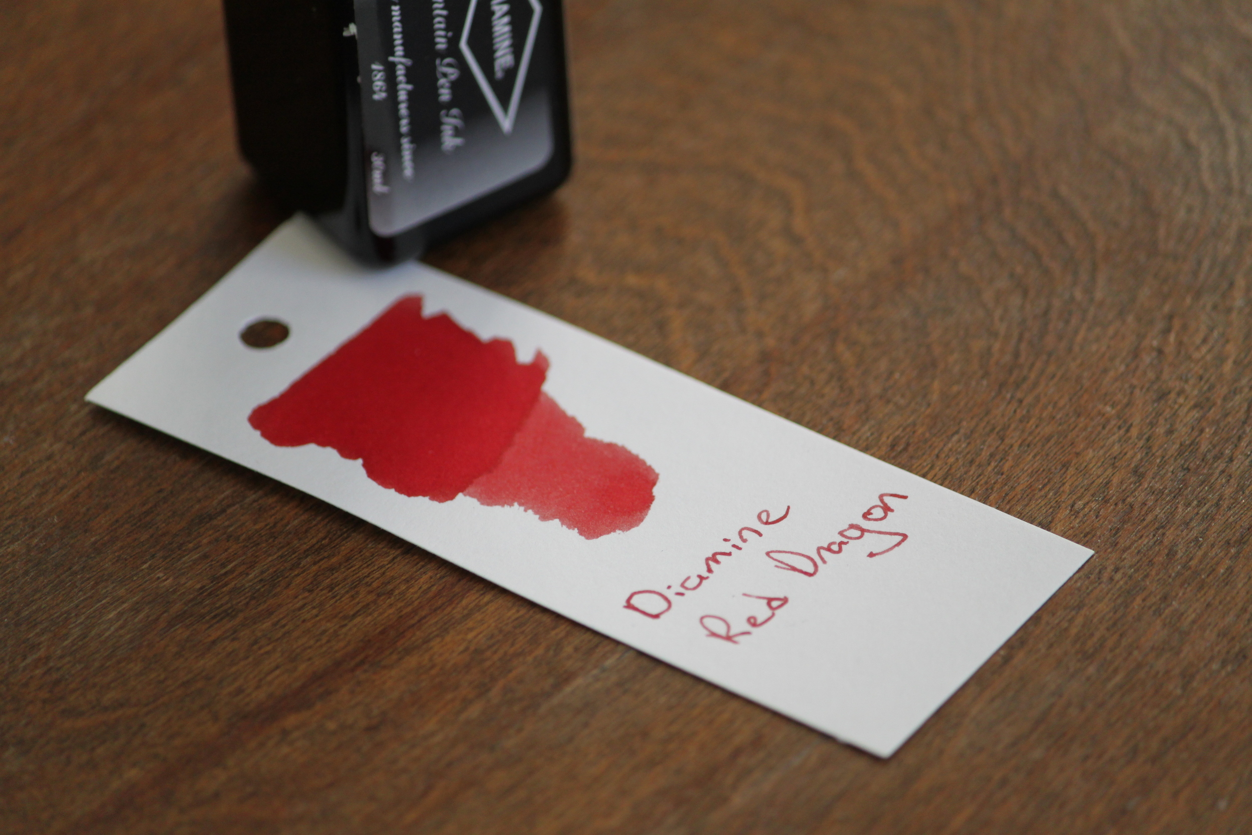
I ventured out in search of the perfect red to fill my TWSBI 580 and settled on Diamine Red Dragon fountain pen ink. It wasnt't the bright ink that I was looking for, but I loved how Red Dragon looked on ink swatches online. The color resembles that of dried blood, with shades of brown. Even though I appreciate the evil villain feel that the ink provides, I love its deep color for everyday writing.
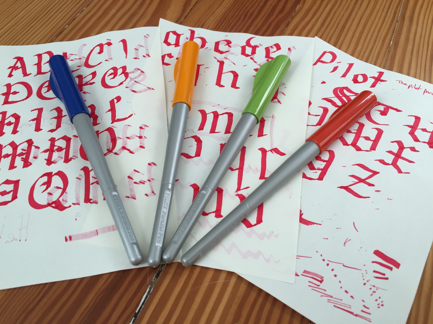
I am very happy with Diamine Red Dragon and have it inked up daily. Dry time is adequate, but I would rate its feathering performance as "medium". Even though I rated feathering as "low" in my handwritten review, further use revealed that this ink performs worse than most of my other inks on cheaper papers. I typically use Red Dragon on student assignments printed on cheap copy paper, and it feathers badly. Plan to use this ink with a nicer pad of paper. Despite the fact that this is not the perfect grading ink that I've been looking for, Diamine Red Dragon's deep color is too beautiful to let go of for now. If you know of any similar inks that perform well on cheap paper, please leave a comment below!

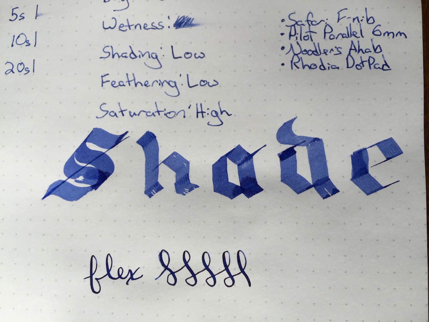
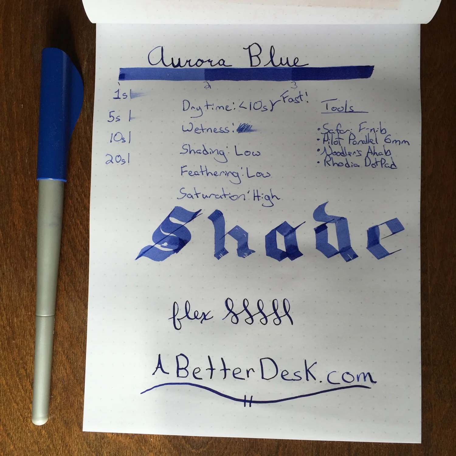
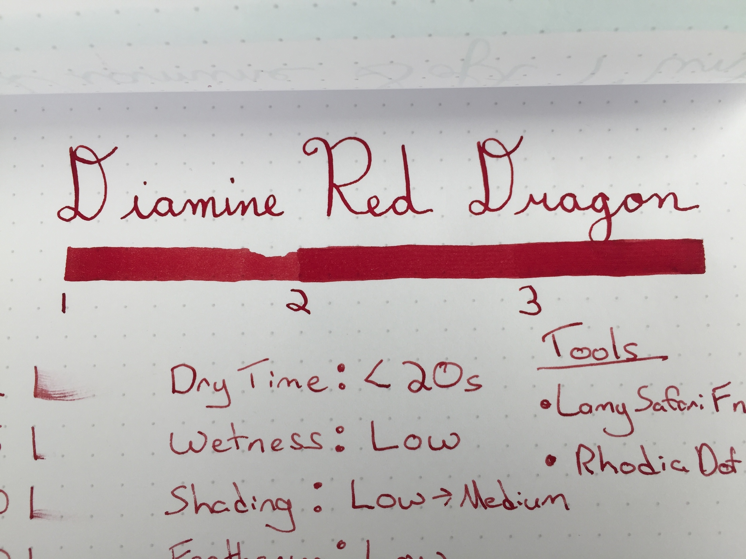
Stats
- Dry Time: Less than 20 seconds
- Wetness: Low
- Shading: Low-Medium
- Feathering: Medium
- Saturation: Medium
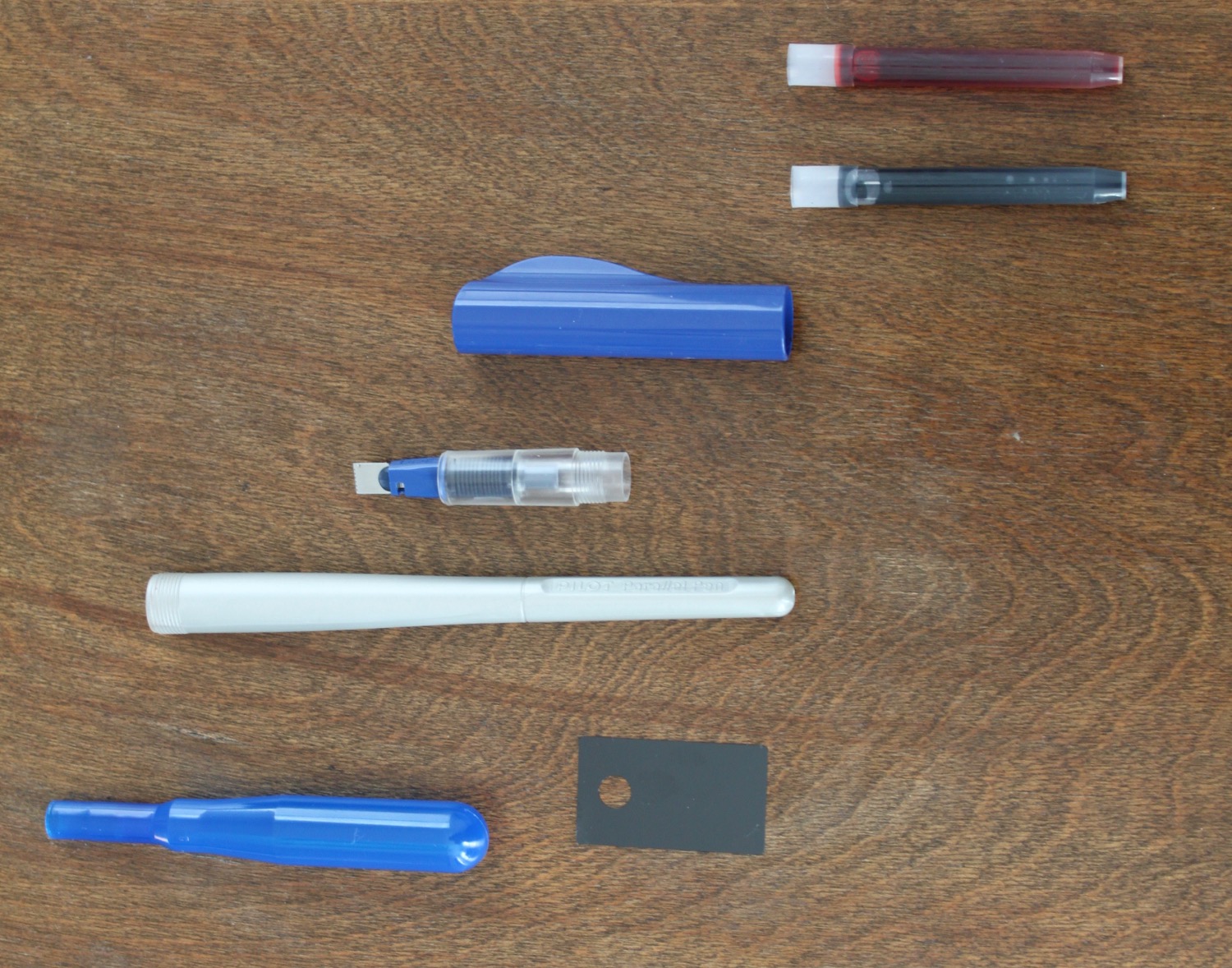
Tools
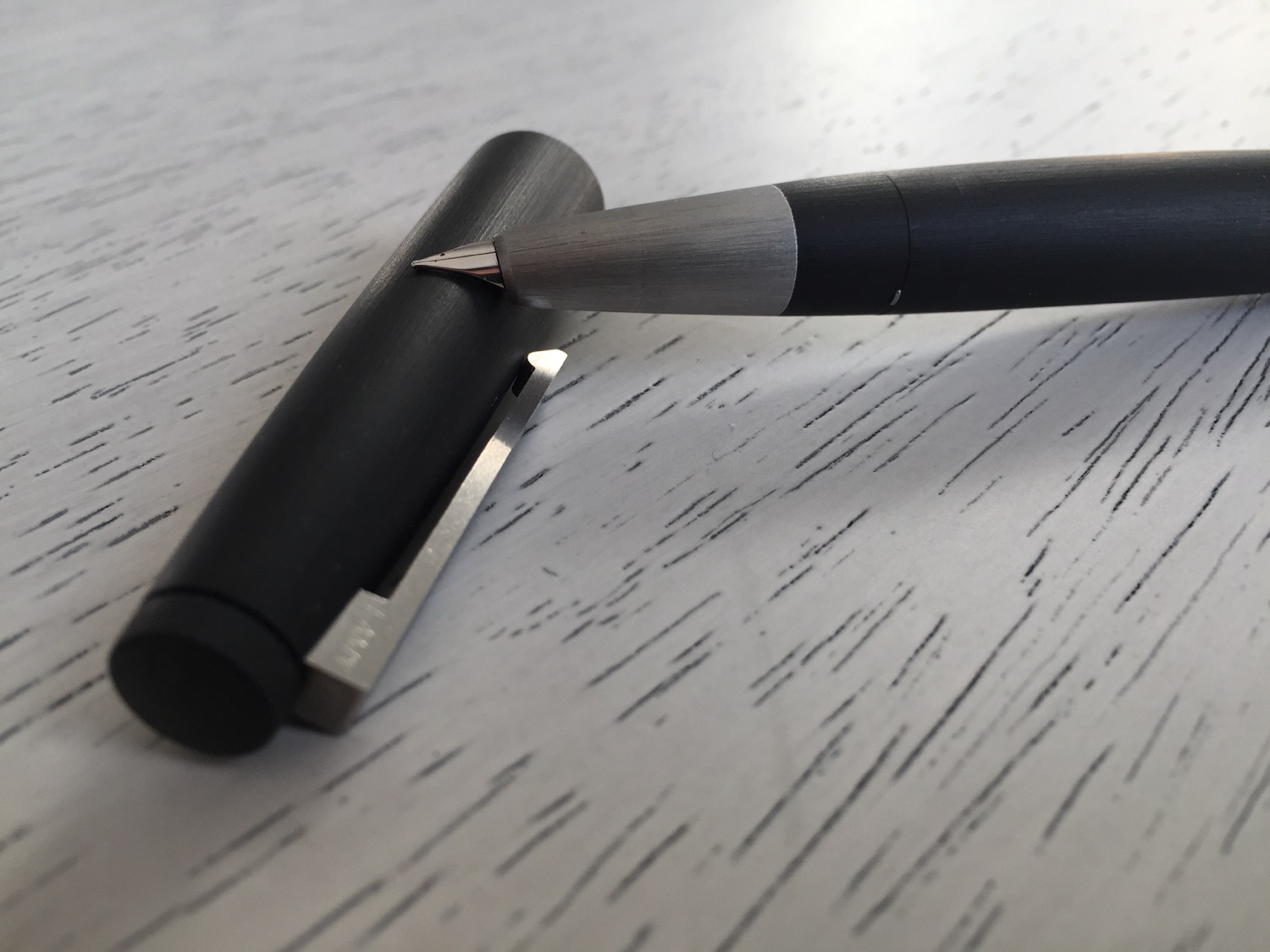
- Lamy Safari - F nib
- Noodler's Ahab - Flex nib
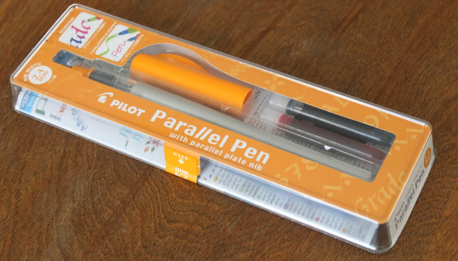
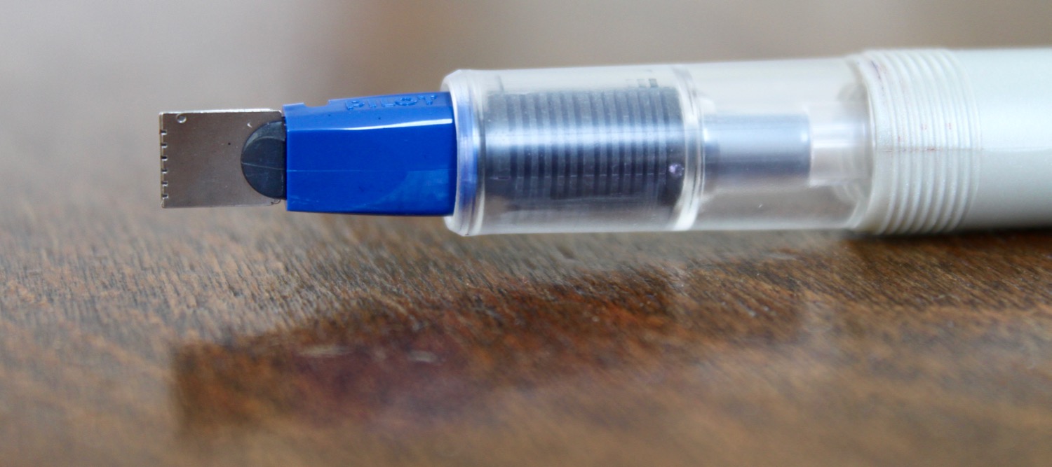
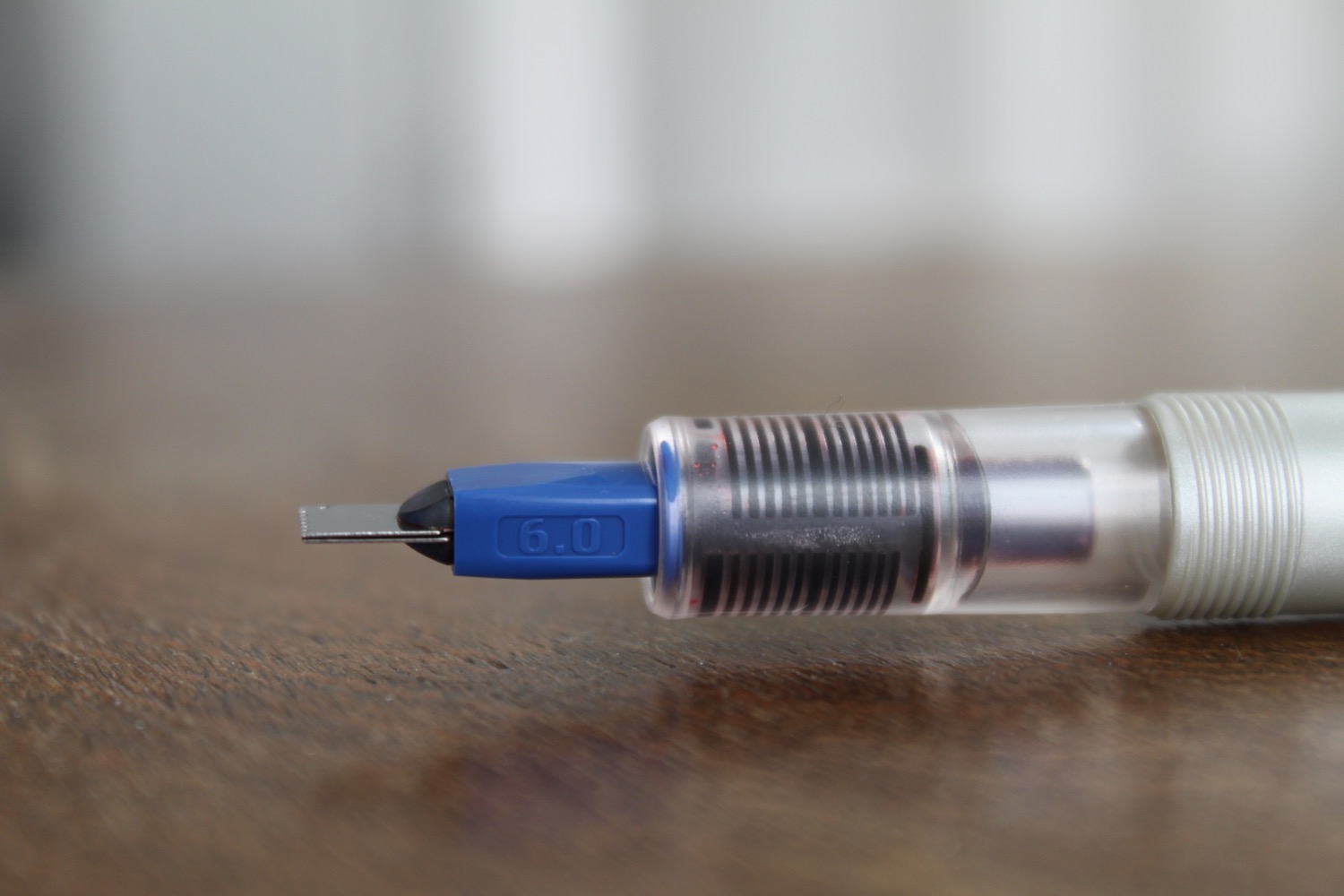
- Pilot Parallel - 6mm nib
- Rhodia DotPad